Calligraphy, in its simplest definition, is the art of beautiful handwriting that requires the use of correct letterforms and harmony of proportions. The term might have been derived from two Greek words, “kallos” (beauty) and “graphein” (to write).
Nowadays, many people associate calligraphy with decorative writing often seen in outdoor signs, posters, creative ads, postcards, greeting cards, and invitations. However, this is more than just a form of beautiful handwriting, as it also played a significant role in the history, arts, languages, and religions of various cultures throughout the world.
The uses of calligraphy range from official documents and religious text to ornamental design in architecture and fine art pieces. Simply put, it can serve as a tool for artistic expression, even though it also has a wide range of practical applications.
Origins of Calligraphy
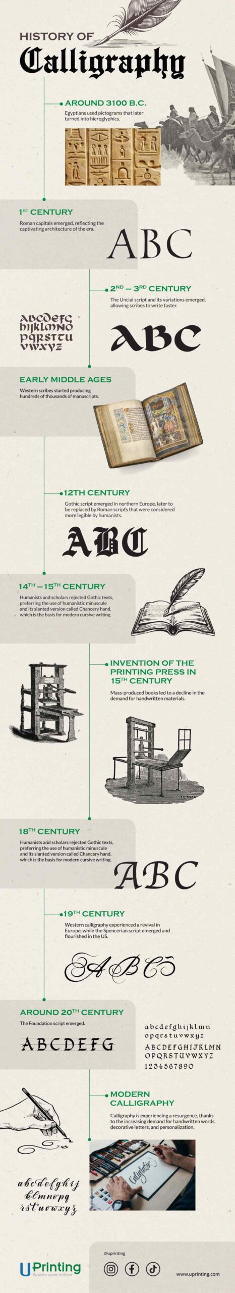
The earliest known examples of calligraphy, or at least something that closely resembled it, were from ancient Egypt. Around 3100 B.C., Egyptians used pictograms that later turned into hieroglyphics that represented words and ideas. Over time, these symbols became more abstract and stylized.
Ancient cultures that invented their own writing styles also had a rich history of calligraphy. This included the Middle East, China, Korea, India and Europe.
The Rise of Western Calligraphy
Western calligraphy is based on the Latin writing system, although there are also some influences from Greek and Cyrillic writing systems. During the Middle Ages, the craft experienced an unprecedented boom when hundreds of thousands of manuscripts were produced, some of which were designed with gold and fine painting.
Roman Capitals
Although the Latin alphabet dates to around 600 B.C., it took six centuries for the Roman capitals to emerge. The script’s letterforms were based on geometry and precision to reflect the captivating architecture of the era.
Most letters in Roman capitals look rounded but can fit within a square, giving them ample space to breathe. However, asymmetrical letters – including B, E, F, J, K, L, P, R, and S – are a bit narrower, taking just half the width of a square.
Uncial Script and Its Variations
The Uncial script was influenced by the Greek alphabet, emerging in the second or third century A.D. Christian churches preferred this script, which was simpler than the Roman capitals, allowing their scribes to write faster. Most of the works of Latin literature 500 years ago used it.
Several variations of the Uncial scripts emerged, but only Carolingian and Insular scripts became the most popular across England and continental Europe.
Gothic Script
Around the 12th century, the Gothic script, also called Black letter, was developed in northern Europe and became particularly popular in German-speaking countries.
The script is characterized by thick and compressed shapes; uniform treatment of vertical strokes ending on the baseline, such as in letters b and I; and angular lines in b, d, o, and p.
Roman scripts, which were considered more legible by humanists, later replaced Gothic throughout Europe, except in Germany where it persisted until 1941, when the Nazi government prohibited its use.
In modern calligraphy, the Gothic script remains popular and is available in different variations, including Lombardic Capitals, Fraktur, Textura, and Batarde.
Humanistic Minuscule
In the 14th and 15th centuries, humanist scholars felt that using Gothic texts was unpractical and straining to the eye. Thus, the humanistic minuscule was created and later adopted in letterpress printing.
Although humanist minuscule was more readable than Gothic script, writing it was too laborious. Thus, Italian scholars created a slightly slanted variation called the Chancery hand (or Chancery cursive) that required fewer strokes and could be joined to other letters. This script is the basis for the cursive writing we use today.
Nowadays, the script is often used to highlight foreign language quotations.
The Invention of Printing Press
The invention of the printing press by Johannes Gutenberg had a profound impact on calligraphy. Before its invention, scribes copied by hand manuscripts, books, land titles, and other written materials.
With the use of printing press, it became possible to mass-produce books, making them more affordable and accessible to people of all social classes. Thus, it led to the decline in the demand for handwritten materials. Calligraphy also became less popular and was displaced by typography, which is the art and technique of creating typefaces.
However, calligraphy did not disappear altogether. It simply became a popular hobby for people who wanted to learn about beautiful handwriting, and businesses and institutions used it for special purposes, such as writing certificates, diplomas, and legal documents.
Despite the widespread use of the printing press, new scripts emerged, such as round hand and Copperplate scripts.
Roundhand Script
In 18th century, Roundhand script was the dominant writing style among English writing masters, whose copybooks were printed using models engraved on metal. Its alphabet was simple, with letters sloping 35 to 40 degrees to the right.
The downstrokes of uppercase and lowercase letters had thick lines through the pressure applied on a flexible nib. Additionally, hairlines were created using the corner of the nib.
Roundhand has long been associated with calligraphy flourishing, which are the strokes of letters that extend into beautiful lines and curves. Flourishing is often used to emphasize certain words or to inject one’s personal style.
Copperplate Script
In the 18th century, writing schools used copper printing plates to produce copybooks from which students could learn by copying the master scribes. This gave rise to the popularity of the Copperplate script, which is based on copper-engraved letters.
This writing style uses a sharp pointed nib instead of the broad-edged nib used in most calligraphy styles.
Copperplate is sometimes erroneously used to refer to Roundhand and other writing styles with flourishing. Although Copperplate and Roundhand scripts look similar at a glance, there are some notable differences.
Copperplate uses a gradual swelling of the broad strokes on curved forms, and its b, e, and o have a narrower backstroke than Roundhand letters.
Today, Copperplate refers to shaded scripts (e.g., Engrosser’s script, Madaraz script, and Italian hand) written with a pointed, flexible nib. Modern calligraphy also takes inspiration from these scripts.
The Revival of Western Calligraphy
The modern revival of western calligraphy began at the end of the 19th century, thanks to the efforts and influence of the Arts and Crafts Movement in England and the aesthetics and philosophy of William Morris.
Morris, an English author, artist, and socialist, was inspired by the ancient practice of scribes and began experimenting with calligraphy. He later established the Kelmscott Press and inspired paper and parchment makers to revive forgotten manufacturing standards.
Spencerian Script
Around the same time as calligraphic renaissance spread across Europe, a new script called the Spencerian emerged and flourished in the US. This style has a flowing oval shape that can be written quickly and legibly.
The script eventually became the standard for writing business correspondence and legal documents across the US, from around 1850 to 1925, until the invention of typewriter made handwritten correspondence outdated.
Spencerian script is characterized by the lack of emphasis on shaded downstrokes on most lowercase letters and the use of only one broad downstroke on uppercase letters. Furthermore, it has minuscules that are considerably smaller than capitals and has letters that have a pronounced oval shape, resulting in confusion between a, e, and o.
Foundation Script
Around the early 20th century, British scribe Edward Johnston saw some ancient manuscripts that had been written using square-cut quills, which produced thick and thin strokes with even pressure. This inspired him to develop the Foundation script, which can have a sloping or angular form.
Foundation script has a clean geometric structure, making it an excellent basis for understanding the formation of lowercase letters.
Modern Calligraphy
Nowadays, interest in calligraphy is experiencing a resurgence, thanks to the increasing demand for handwritten words, decorative letters, and personalization. It also adds beauty and character to logo designs, greeting cards, invitations, diplomas, business cards, books, poetry, maps, menus, and handmade presentations.
The introduction of beginner-friendly brush pens and the widespread use of digital mediums (like iPads) have also made calligraphy more accessible to people of different backgrounds.
Final Thoughts
Although simpler and more legible scripts emerged over the centuries, today’s calligraphers are still inspired by the disciplined letterforms and style of this centuries-old art form.
The history of calligraphy is a long and fascinating one, serving as a testament to human creativity, brilliance, and ingenuity. We hope this article will inspire you to try learning the art of beautiful handwriting, which can serve as a rewarding and fulfilling hobby, or even a profitable side hustle or business.