33-Point Print Check
| 33
checkpoints for printing perfection

- Custom Product Builder
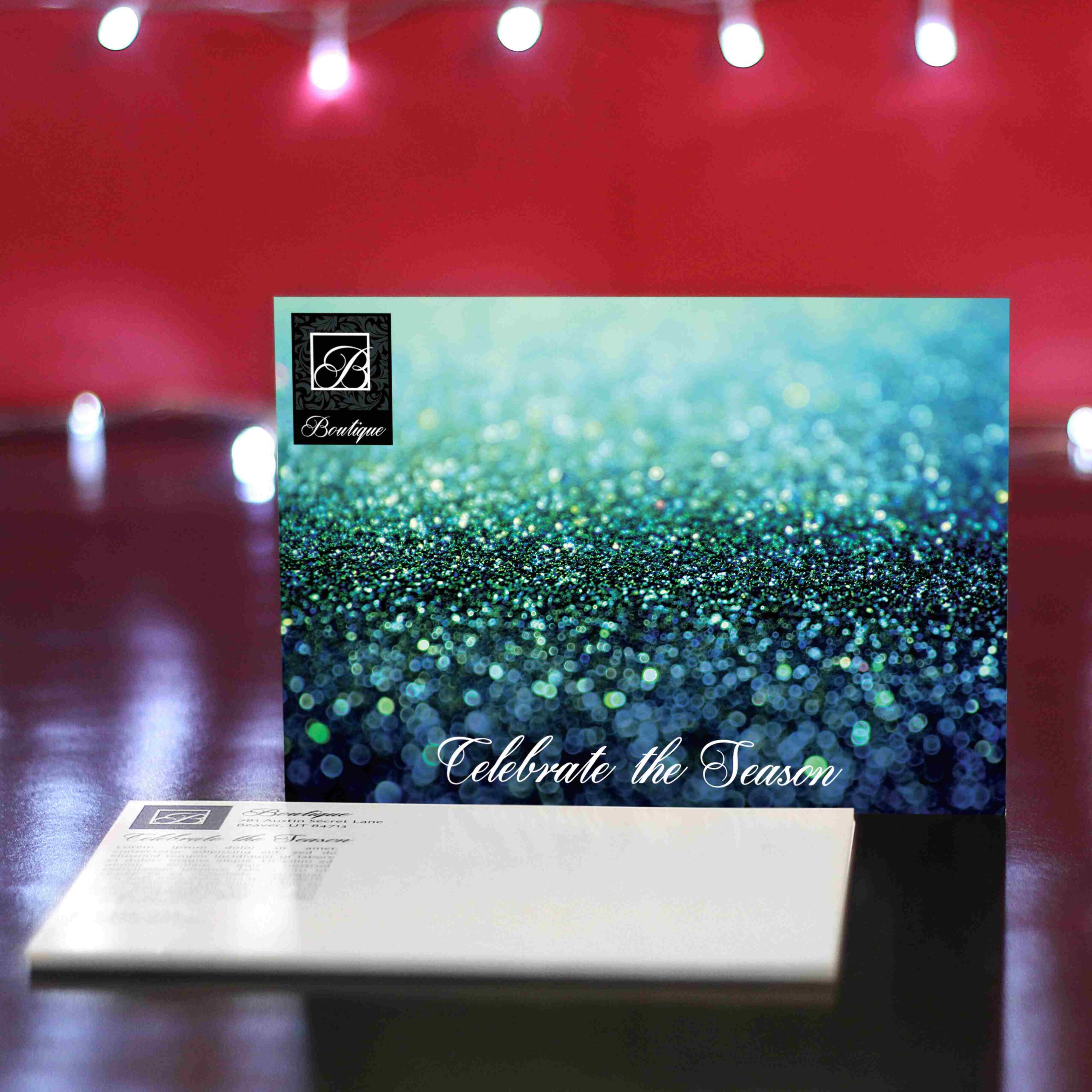
- Marketing Materials
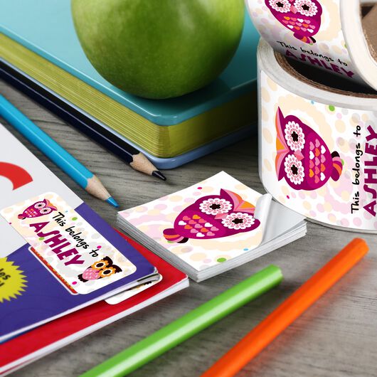
- Stickers & Labels
- Boxes & Packaging
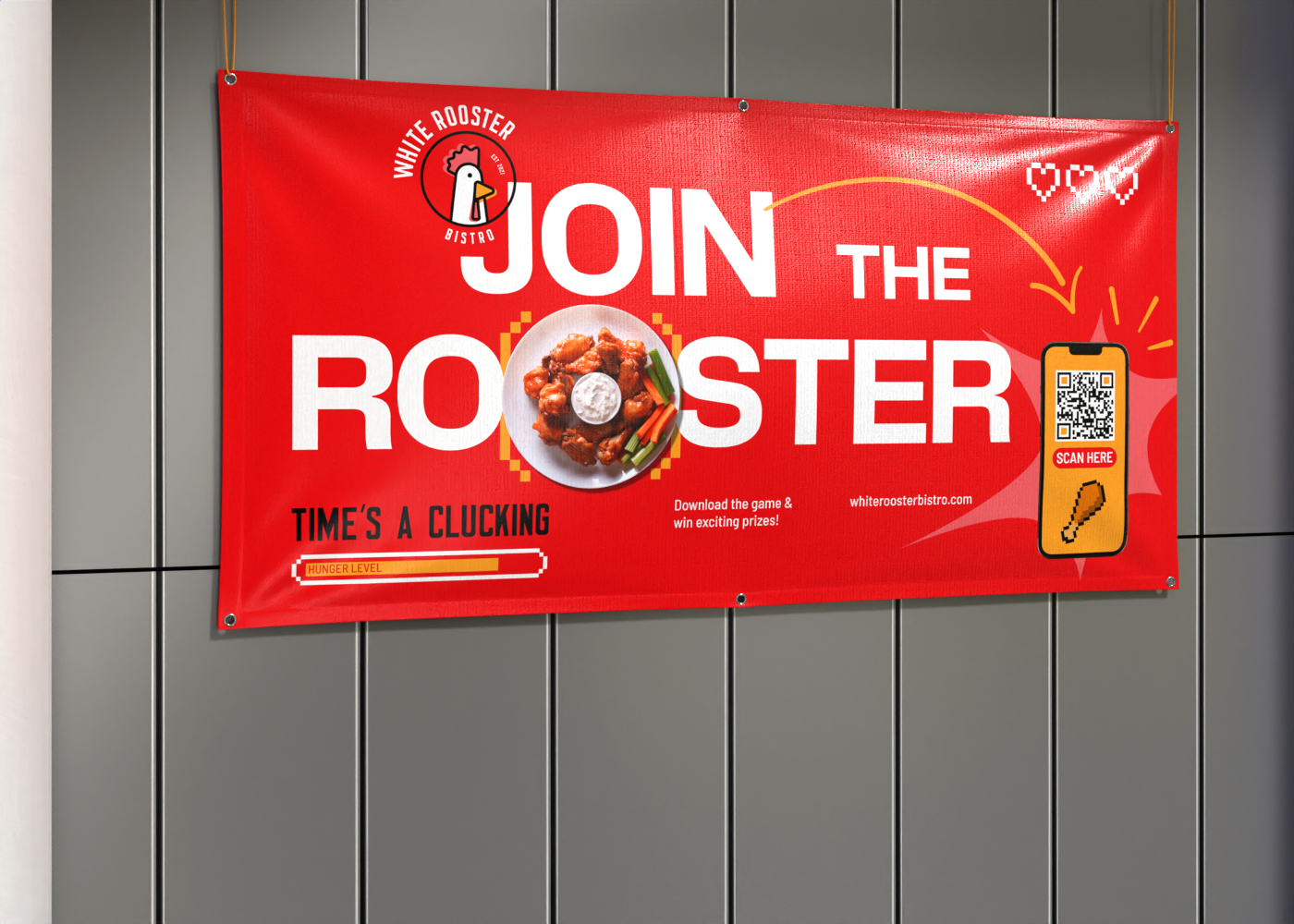
- Signs, Banners & Decals
- Apparel
-
Events and Holidays
-
Forms and Stationery
- Mailing Services
- Promotional Products
-
Photo Products
- Custom Quote
- Design Services
- Business Cards
- Flyers
- Brochures
- Postcards
- Booklets
- Catalogs
- Bookmarks
- Menus
- Newsletters
- Posters
- Rack Cards
- Sell Sheets
- Calendars
- Door Hangers
- Mailer Boxes
- Shipping Boxes
- Product Boxes
-
Retail Boxes
-
Bags and Pouches
- Flat Mailers
- Branded Packaging Supplies
- Labels
- Stickers
- Hang tags
-
Media Packaging
- Acrylic Signs
- Aluminum Signs
- A-Frame Signs
- Backdrops
- Banners
- Car Magnets
- Decals
- Flags
- Pop Up Display
- Posters
- Warning & Safety Signs
- Yard Signs
- Window Clings
- Event Banners
- Event Postcards
- Event Tickets
- Gift Certificates
- Greeting Cards
- Invitations
- Posters
- RSVP Cards
- Save the Date Cards
- Save the Date Magnets
- Stickers
- Table Tents
- Thank You Cards
- Appointment Cards
- Business Cards
- Carbonless Forms
- Envelopes
- Folders
- Labels
- Name Tags
- Letterhead
- NCR Forms
- Notepads
- Note Cards
- Notebooks
- Pens
- Rubber Stamps
- Standard Business Cards
- Square Business Cards
- Plastic Business Cards
- Die-Cut Business Cards
- Painted Edge Business Cards
- Foil Business Cards
- Folded Business Cards
- Magnetic Business Cards
- Raised Spot UV Business Cards
- Silk Business Cards
- View all Business Cards
- Brochures
- Leaflets
- Mailing Brochures
- Mini Brochures
- Pamphlets
- Tabbed Mailing Brochures
- View all Brochures
- Standard Postcards
- Direct Mail Postcards
- EDDM® Postcards
- Foil Postcards
- Folded Postcards
- Metallic Postcards
- Raised Spot UV Postcards
- Silk Postcards
- Spot UV Postcards
- Velvet Postcards
- Die-Cut Postcards
- All Postcards
- Custom Stickers
-
Specialty Stickers
- Straight Tuck-End Boxes
- Reverse Tuck-End Boxes
- Snap-Lock Bottom Boxes
- Auto-Lock Bottom Boxes
- 5-Panel Hanging Boxes
- Seal-End Boxes
- Pillow Boxes
- Box Sleeves
- View all styles
- Pouches
- Stand-Up Pouches
- Flat Pouches
-
Branded Bags
- Gift Bags
- Plastic Bags
- Paper Bags
- Beer Labels
- Wine Labels
- Jar & Canning Labels
- Food Labels
- Soap Labels
- Cosmetic Labels
- Candle Labels
- View all labels
-
Standard Hang Tags
-
Premium Hang Tags
- Custom Hang Tags
- View all hang tags
- A-Frame Replacement Signs
- Metal Rod A-Frame
- Metal Rod A-Frame (SIGN Only)
- Sandwich Boards
- Simpo II A-Frame
- Vinyl Banners
- Step and Repeat Banners + Stand
- Step and Repeat Banners
- Deluxe Retractable Banner
- Retractable Banners
- Fabric Banners
- Mesh Banners
- Pole Banners
- Retractable Banner Stands
- Table Banners
- Tension Fabric Stand
- X Banner Stands
- View all Banners
- Replacement Straight Tension Pop Up Display
- Pop Up Display with Display Frame
- Pop Up Display Replacement
- Curved Tension Pop Up Displays
- Pop Up Display with Frame
- Straight Tension Pop Up Displays
- Hand Washing Signs
- Watch Your Step Signs
- Restricted Area Signs
- Do Not Enter Signs
- Custom Poster Signs
- Workplace Safety Posters
- Product Safety Labels
- Mens T-Shirts
- Ladies T-Shirts
- Short Sleeve T-Shirts
- Dry Performance T-Shirts
- Long Sleeve T-Shirts
- Tank Tops
- Carhartt T-Shirts
- Nike T-Shirts
- Under Armour T-Shirts
- Work T-Shirts
- Dry Performance Polo Shirts
- Short Sleeve Polo Shirts
- Mens Polo Shirts
- Ladies Polo Shirts
- Long Sleeve Polo Shirts
- Nike Polo Shirts
- Under Armour Polo Shirts
- Adidas Polo Shirts
- Trucker Hats
- Unstructured Hats
- Structured Hats
- Cotton Caps
- Visors
- Beanies
- Nike Hats
- New Era Hats
- Under Armour Hats
- Soft Shell Jackets
- Fleece Jackets
- Windbreakers
- Work Jackets
- Mens Jackets
- Ladies Jackets
- Vests
- Insulated Jackets
- Quarter Zip Jackets
- The North Face Jackets
- Carhartt Jackets
- Under Armour Jackets
- View All Jackets
- Hooded Sweatshirts
- Full Zip Sweatshirts
- Crewneck Sweatshirts
- Quarter Zip Sweatshirts
- Mens Sweatshirts
- Ladies Sweatshirts
- Sweatpants
- Carhartt Sweatshirts
- Nike Sweatshirts
- Under Armour Sweatshirts
- Champion Sweatshirts
- Workwear Sweats
- Workwear T-Shirts
- Workwear Jackets
- Carhartt Workwear
- Safety Workwear
- Scrubs and Lab Coats
- Industrial Workwear
- Aprons
- Dress Shirts
- Dickies Workwear
- Red Kap Workwear
- The North Face Bags
- Backpacks
- Tote Bags
- Duffel Bags
- Shopping Bags
- Promotional Backpacks
- Promotional Tote Bags
- Messenger Bags
- Adidas Bags
- Timbuk2 Bags
- View All Bags
- Flat Greeting Cards
- Folded Cards
- Greeting Cards
- Metallic Flat Greeting Cards
- Metallic Folded Greeting Cards
- Silk Flat Greeting Cards
- Silk Greeting Cards
- Business Cards
- Custom Business Cards
- Magnetic Business Cards
- Plastic Business Cards
- Premium Business Cards
- View All Business Cards
- Gift Card Holders
- Gift Certificate Holders
- Key Card Holders
- Mini Folders
- Pocket Presentation Folders
- Silk Presentation Folders
- Custom Labels
- Address Labels
- Business Labels
- Name Labels
- Product Labels
- Return Address Labels
- Shipping & Mailing Labels
- Backpacks
- Duffel Bags
- Messenger Bags
- Tote Bags
- Shopping Bags
- Promotional Backpacks
- Promotional Tote Bags
- Adidas Bags
- Timbuk2 Bags
- The North Face Bags
- View All Bags
- Notebooks
- Pens
- Stress Balls
- Memo & Sticky Pads
- Lanyards & Badge Holders
- Memo Clips
- Magnets
- Padfolios
- Bulk Stickers
- Cut-to-Size Stickers
- Die-cut Stickers
- Kiss Cut Stickers
- Sticker Singles
- Sticker Sheets
- Roll Stickers
- Transfer Stickers
- View All Stickers
- Bumper Stickers
- Clear Stickers
- Floor Stickers
- Metallic Stickers
- Oval Stickers
- Round Stickers
- Vinyl Stickers
- Business Stickers
- Campaign & Political Stickers
- Event Stickers
- Kids Stickers
- Name Stickers
- Promotional Stickers
- View All Stickers
- Beverage Labels
- Bottle Labels
- Candle Labels
- Canning Labels
- Cosmetic Labels
- Food Labels
- Jar Labels
- Packaging Labels
- Soap Labels
- Warning Labels
- Water Bottle Labels
- Wine Labels
- View All Labels
- Clear Labels
- Die-cut Labels
- Kids Labels
- Metallic Labels
- Oval Labels
- Paper Labels
- Roll Labels
- Round Labels
- Vinyl Labels
- Waterproof Labels
- View All Labels
- Circle Hang Tags
- Die-Cut Hang Tags
- Folded Hang Tags
- Half Circle Hang Tags
- Leaf Hang Tags
- Oval Hang Tags
- Rectangular Hang Tags
- Rounded Corner Hang Tags
- Single Rounded Corner Hang Tags
- Circle Cards
- Die-Cut Business Cards
- Folded Business Cards
- Half-Circle Cards
- Leaf Cards
- Oval Cards
- Rounded Corner Cards
- Single Rounded Corner Cards
- Slim Cards
- Slim Rounded Corner Cards
- Square Business Cards
- View All Business Cards
- Foil Business Cards
- Metallic Business Cards
- Painted Edge Business Cards
- Raised Foil Business Cards
- Raised Spot UV Business Cards
- Silk Business Cards
- Spot UV Business Cards
- Velvet Business Cards
- View All Business Cards
- 2-Color Stick Up Grid, English (13-Month)
- American Splendor
- American Splendor Desk
- American West by Tim Cox
- Blue & Black Contractor's Memo (13-sheet)
- Landscapes of America - Stapled
- Landscapes of America English - Spiral
- Multi-Color Desk Pad
- Red & Black Contractor's Memo (13-sheet)
- Scenic Almanac
- Span-A-Year Non-Laminated
- Time Management Span-A-Year (Laminated w/ Marker)
- View All Calendars