
The logo evolution of these two brands reveal colorful histories and massive ideological differences.
Few brands are more familiar worldwide than carbonated drink giants Coke and Pepsi. While their end products are functionally the same, there are major differences with their overall branding strategies — most noticeably with how frequently they each changed their logos.
Source
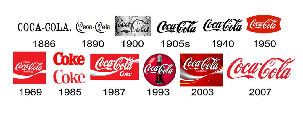
That is to say, over the years, Coke has barely changed much, with typefaces while Pepsi has changed quite a lot with each generation, beginning in the 1960’s.

Source
Pepsi
How Much Did it Cost?:
$1,000,000 (2006), other branding aspects not included. (source)
Fun Facts!
- The “blob” version above was widely mocked when it was first unveiled in 2006.
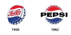
- The round blue and red visual motif — officially known as the Pepsi Globe is a take on the distinctive trademark bottle cap colors Pepsi used beginning shortly after WW2.
- Pepsi used the same logotype as Coca-Cola early in its history.
- In the early 60’s, Pepsi execs decided the blue and red swirls were more iconic than the logotype, and they made the switch to a sans serif font to modernize their image. Among the many companies that switched to a sans serif logotype around this era were Nestlé, Mattel, National/Panasonic, American Airlines, Toyota — and many, many others.
- Pepsi was named after an enzyme – pepsin. A testament to the medical quackery of its origins.
- It was first introduced as Brad’s Drink in New Bern, North Carolina.
Coca-Cola
How Much Did it Cost?:
$0 — according to Coca-Cola. It may have started out free, but just using basic critical thinking, it’s safe to say they pay designers for every iteration, whether on a retainer or on some other basis.
Fun Facts!
- Created by Coca-Cola bookkeeper (later director) Frank Mason Robinson, in 1885.
- The logotype is based on the Spencerian script, as Frank Mason Robinson executed it with the help of a local Atlanta engraver named Frank Ridge.
- The Spencerian script was developed in the mid-19th century and was the dominant form of formal handwriting in the United States until it was replaced by the Palmer method in the early 20th century. Another notable brand that uses the same logotype today is the Ford Motor Company.
- Frank Mason Robinson never got a bonus or a raise for his work. He did lay the foundations for Coca-Cola’s enduring image, not just with his handwriting, but by planning many of its early marketing campaigns as well.
- It’s not factual to say that the Coca-Cola logo has not changed for a few reasons:
- Coca-Cola used different fonts before 1900.
- There have very clearly been changes to the logo design with each new product variant and with each era.
- Coca-Cola entirely changed its logotype to serifed typeface that simply said “Coke” during the three months of the ill-fated New Coke experiment.
- However, it is entirely accurate to say that the basis of the Coca-Cola logo, its logotype or wordmark, has not significantly changed over the past 110 years,
Why does Pepsi change logos so often, while Coca-Cola barely does?
In the simplest terms, Coca-Cola has consistently built it’s identity and value around tradition, while Pepsi has done the opposite, favoring an approach that attempts to keep the brand forever contemporary.
And it has little to do with product quality either — it’s just what their regular consumers expect.
Pepsi for instance, did not even begin to approach Coca-Cola in terms of sales nor brand loyalty up until it actively attempted to rebrand itself as the hip, modern counterpoint to Coke in the early 1960’s — beginning with its transition from a Spencerian script font similar to Coca-Cola’s to a sans serif font.
After two decades of continually appealing to younger, less traditional consumers, Pepsi had significantly eroded Coca-Cola’s market lead, causing them to do the unthinkable — change their product entirely.
When Coca-Cola introduced New Coke in 1985, they were pretty sure it would be a success, as test groups had overwhelmingly preferred the new, Pepsi-like formula to the traditional one. After all, most consumers seemed to prefer Pepsi when asked to take the infamous Pepsi Challenge.
However, when it was introduced to market, it was roundly rejected by consumers and the whole incident became a textbook case on misunderstanding markets. When the classic formula was reintroduced a few months later, Coca-Cola actually had a jump in sales.
What we can learn
- Logos and labels should be a reflection of what you want your brand to be. They are not your brand.
- A brand whose philosophy is to be forever contemporary will always be in flux. This is not easy for anyone to maintain. Sometimes however, it might be the only choice for staying competitive.
- A brand that appeals to both traditional and contemporary audiences is ideal, but not everyone can achieve it.
- How a product performs is often secondary to how the product makes the user feel.
- Branding — and logos — are how you influence your market’s emotional responses. Here are a few logo design ideas to get you started!
How does your brand and logo appeal to customers? Comment below!
Disclaimer: Images on this page are not owned by UPrinting and are used solely for educational purposes. Please click on the images to see their original sources.