On average, recruiters spend six to eight seconds looking at applicants’ resumes before determining their suitability for the position. And the content of your resume isn’t the only thing they look at — your font choice can also help make an impression, whether good or bad.
The right font can enhance your resume’s readability and create a good first impression. On the flip side, the wrong one can make your CV look unprofessional and difficult to read, derailing your chances for an interview.
Even though you find your favorite font creative or eye-catching, it doesn’t necessarily mean it will look good on your resume. So, before you even think about using it, check out our list of worst fonts for a CV and why they don’t work in the professional world.
We also share a list of resume-friendly fonts that exude professionalism, confidence, and trustworthiness.
10 Fonts to Avoid on Your Resume
Choosing the wrong font can make or break your job application.
1. Comic Sans MS
Comic Sans is a sans-serif font, meaning it does not have “feet” or extending features at the end of strokes. This typeface was originally designed for cartoon quote bubbles and other informal communications. Today, it’s often used in memes and other casual scenarios.
Why it’s a poor choice: Comic Sans looks too casual and relaxed, making it better suited for informal communications. It also becomes difficult to read in smaller text sizes, making it ineffective for CVs and other printed materials.
2. Papyrus
Papyrus is a calligraphic font with several distinct characteristics, including high horizontal strokes, irregular curves, and rough edges. As the name suggests, it resembles the look of ancient Egyptian writing on papyrus paper.
Why it’s a poor choice: The font lacks sophistication and becomes unreadable when used in blocks or strings of small text.
3. Courier
Courier was designed as a typewriter face for IBM, featuring a monotone weight and equal spacing between letters. This makes it resemble tabular work, technical documentation, or source code.
Why it’s a poor choice: The typewriter effect looks outdated and dull. Moreover, it becomes difficult to read if presented in all caps.
4. Impact
Impact has a noticeably high x-height, which refers to the height of lowercase letters like “x,” “v,” “w,” and “z.” Other distinct features include compressed letter spacing, thick strokes, short ascenders and descenders, and minimal interior counter-form.
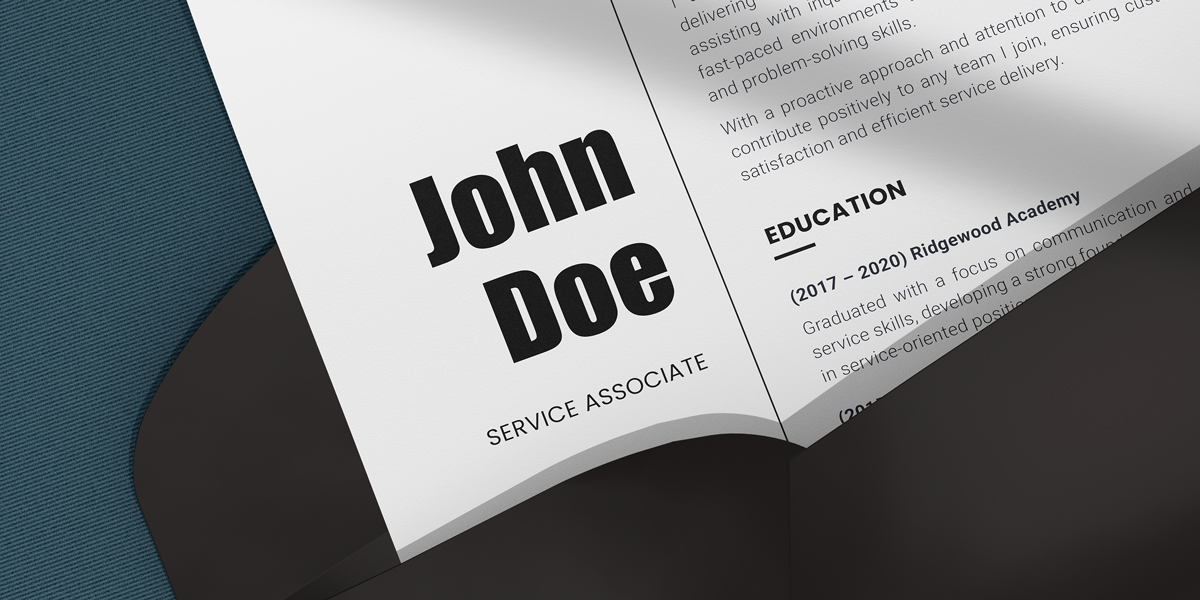
Why it’s a poor choice: The font has too much impact—so much so that it seems to be “shouting” at the reader. Its loudness and boldness make it unsuitable for professional communications.
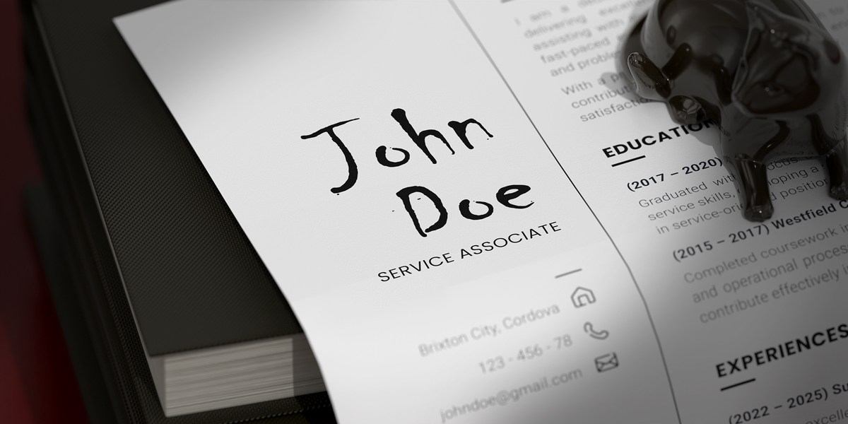
5. Brush Script
Brush Script features energetic strokes that resemble handwriting with a thick brush effect, adding a playful and artistic vibe. Consequently, it’s a popular choice among artists who need a font to emphasize the creative touch in their designs.
Why it’s a poor choice: The rough cursive appearance looks too laid-back and elaborate for formal communications. Additionally, the font becomes hard to read at smaller sizes, especially in long blocks of text.
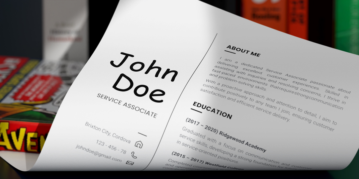
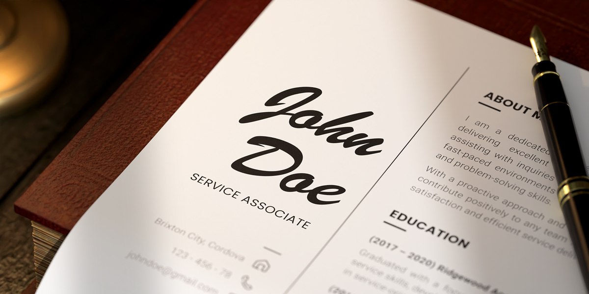
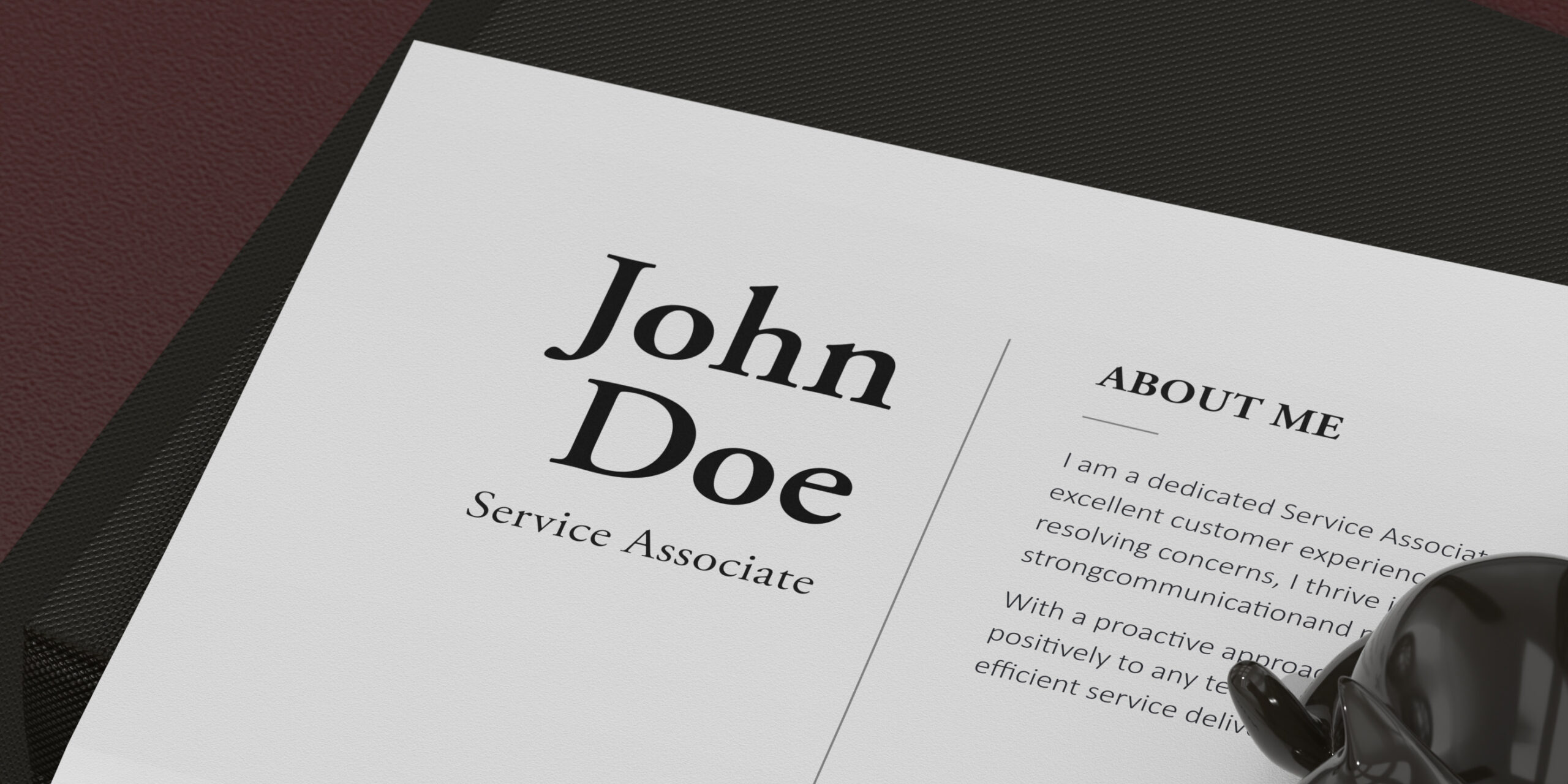
6. Times New Roman
Times New Roman was originally designed for newspaper printing, featuring narrow characters and tight spacing to allow publishers to fit more text per line. Notable characteristics include prominent diagonal stress, tall numerals, thin and sharp serifs, and a high x-height.
Why it’s a poor choice: It’s considered typographically outdated and boring. Some readers also find the font “too tight,” making it difficult to read on screens.
7. Curlz MT
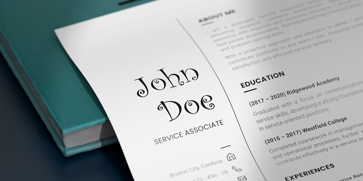
Curlz MT is characterized by wavy strokes and swirls at the beginning and end of letters, giving it a bent, twisted-metal appearance. Nowadays, designers use it for playful and carefree titles.
Why it’s a poor choice: The font becomes unreadable when used in body copy or long blocks of text. It also delivers a very laid-back, playful vibe, making it only suitable for T-shirts, posters, flyers, party invitations, and other novelty products.
8. Jokerman
Jokerman is a heavily decorated typeface featuring spirals, spikes, dots, and straight lines integrated into the characters. Although the “embellishments” seem random, the letterforms have distinct characteristics: low x-height, swaying stems, and bulging curves.
Without the ornamentation, Jokerman resembles Comic Sans’ taller and curvier sibling.
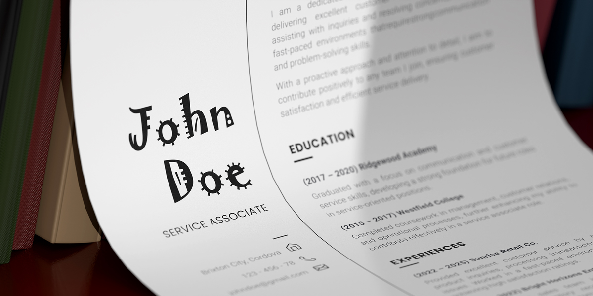
Why it’s a poor choice: Jokerman is almost unreadable due to the excessive use of ornaments on the characters, making it impractical for professional use.
9. Chiller
hiller is deemed the ultimate “scary” font, making it a staple in horror film posters, Halloween invitations, and gory video games. It has a distressed, handwritten style with uneven and rough textures, irregular strokes, and an overall chaotic appearance.
Why it’s a poor choice: The font is only suitable for designs that require a creepy and unsettling aesthetic—definitely not something you want on your resume or in any formal communication.
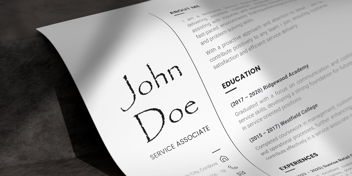
10. Lucida Handwriting
Lucida Handwriting is a typeface designed to resemble informal cursive handwriting created with felt- or plastic-tipped pens or markers. It features a large x-height, widely spaced letters, and relatively narrow, short uppercase characters.
The font has a relaxed and vigorous form, making it pleasant for casual reading on screens and in print.
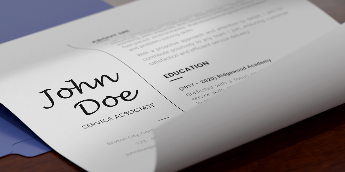
Why it’s a poor choice: The lively cursive style appears too friendly and warm for professional communications. It also requires more line spacing to accommodate the ascenders and descenders. Without sufficient space, the typeface becomes difficult to read.
Now that you know which fonts to avoid, it’s time to explore the ones that look good on your resume. You may notice that the typefaces listed here look quite different from one another, but they share certain similarities: They all look clean, professional, and easy on the eye.
The fonts are also easily scanned and interpreted by an Applicant Tracking System or ATS, which is a software application that helps HR departments manage recruitment and hiring tasks digitally.
ATS-friendly fonts are almost a necessity in today’s labor market. Up to 90% of employers, including most Fortune 500 companies, use software apps to manage candidate applications.
6 Best Fonts to Use on Your Resume
Choosing the right font makes your resume stand out for the right reasons!
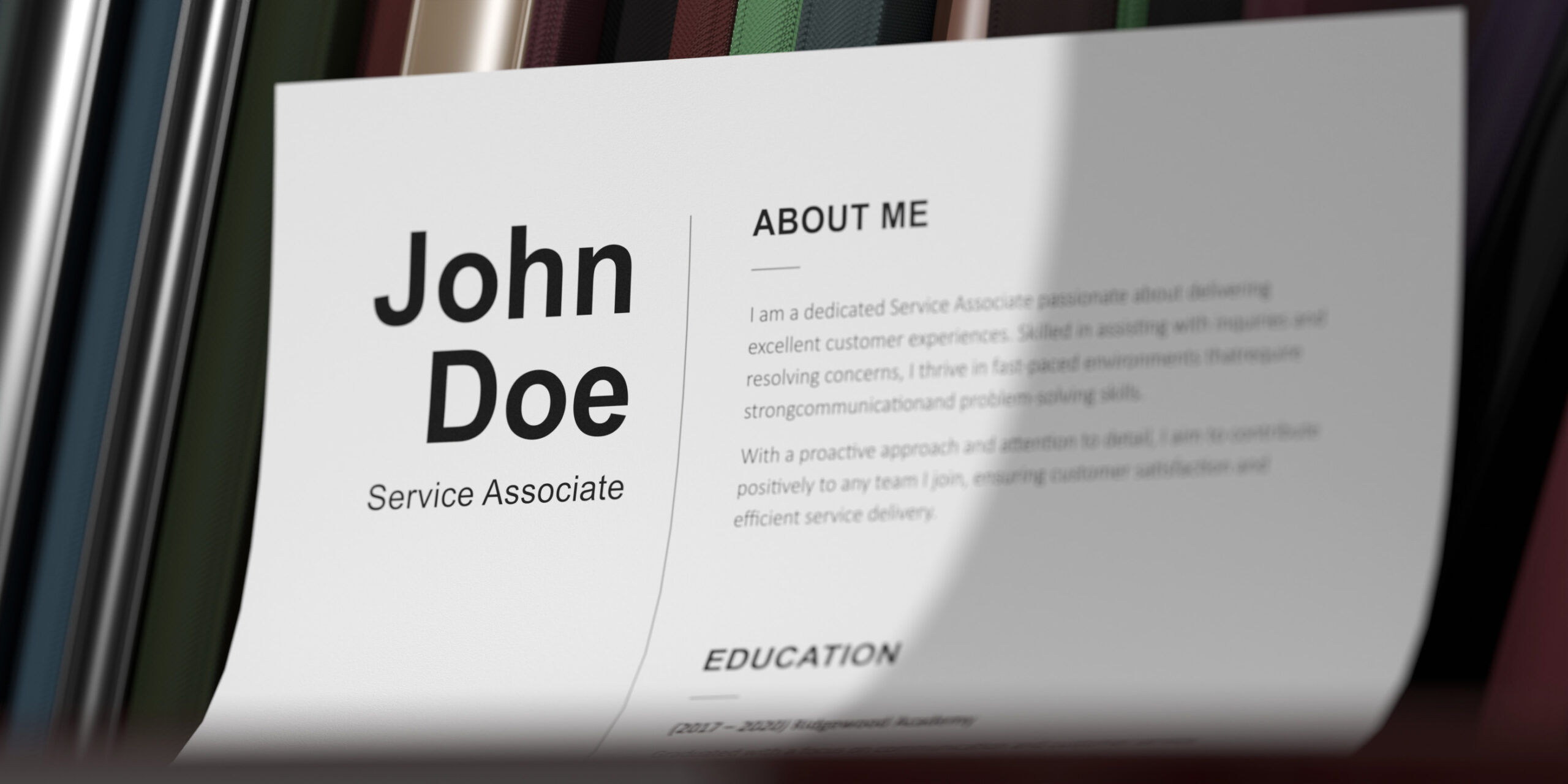
1. Calibri
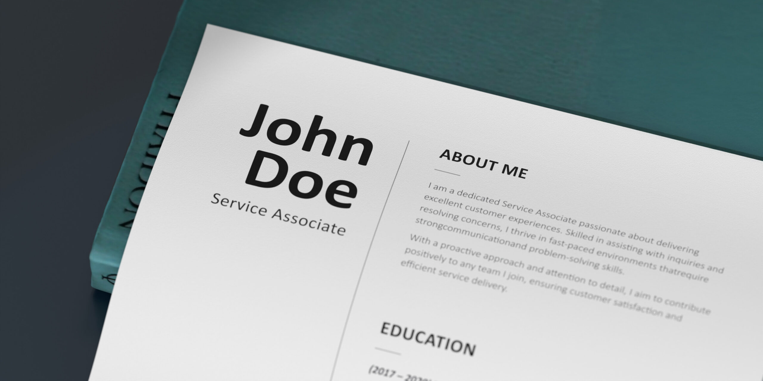
Calibri is a contemporary sans-serif typeface known for its clean letterforms and lack of bunting, making it one of the best fonts for screens. After dethroning Times New Roman, it was the default typeface in programs like PowerPoint, Word, and Outlook for 17 years.
Calibri is also suitable for various text-based documents, such as resumes, cover letters, and business proposals. In terms of readability, it closely resembles Arial.
Why it’s a good choice: The font is versatile and looks good on screens and text-based documents.
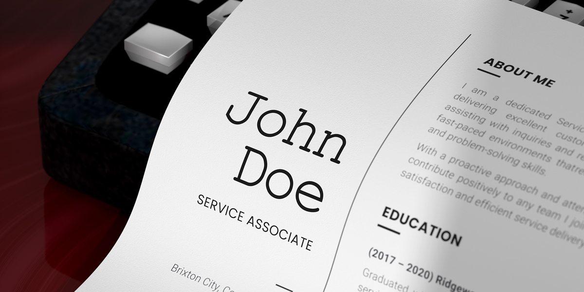
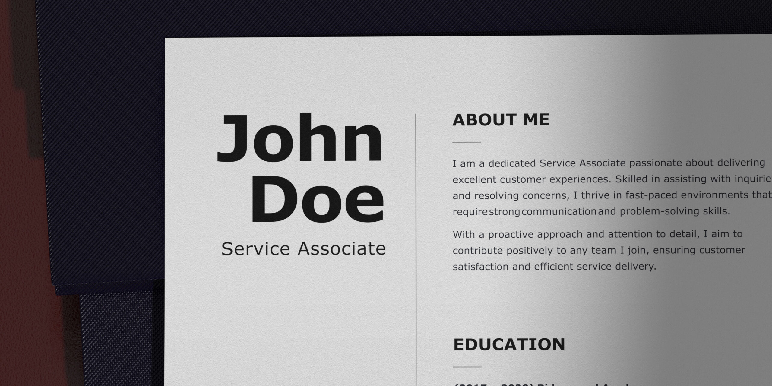
2. Arial
As a contemporary sans-serif font, Arial offers excellent legibility and readability but contains more humanist characteristics than many of its industrial-style predecessors.
Arial closely resembles Helvetica but with fuller and softer curves and more open counters. Furthermore, the strokes on its letters (such as “c,” “g,” and “s”) have a more natural angle in relation to the stroke direction, whereas in Helvetica they look as if they were cut off abruptly.
Why it’s a good choice: The font is versatile and looks good on screens and text-based documents.
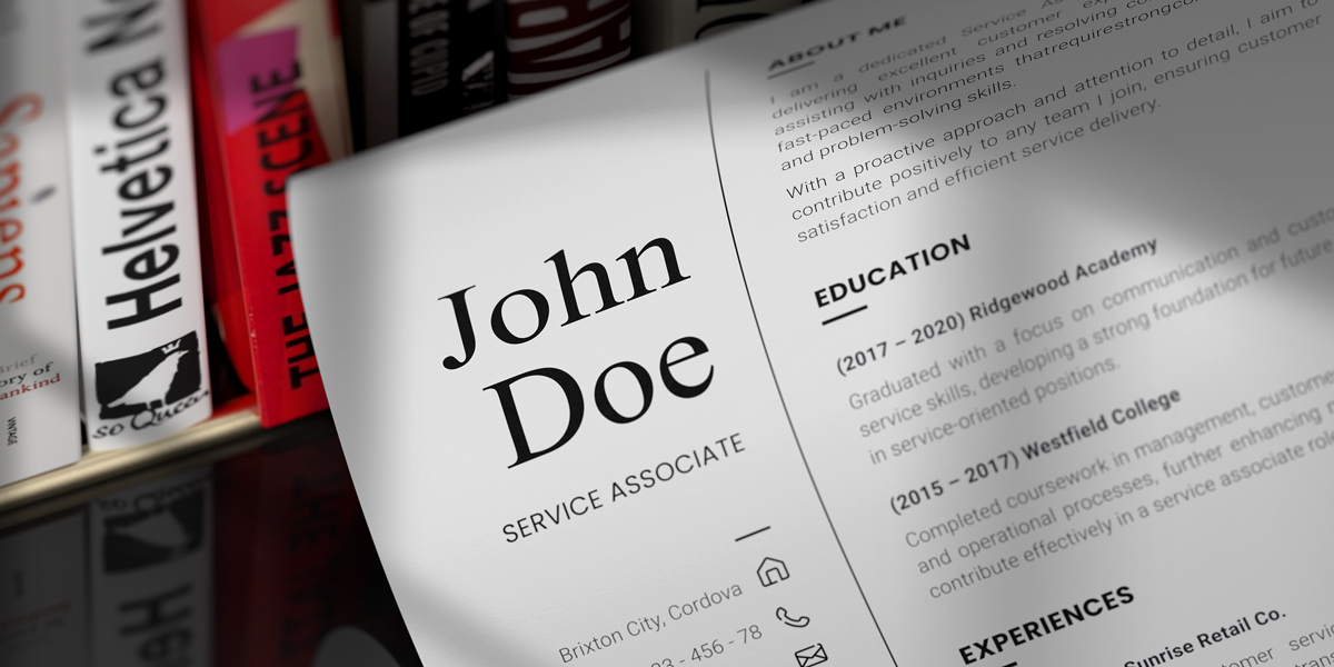
3. Garamond
Garamond has letterforms with a somewhat organic structure resembling handwriting with a pen but slightly more upright. A Parisian engraver named Claude Garamond created this old-style serif typeface in the 16th century.
The typeface has capital letters modeled on Roman square capitals, clear stroke contrast, and distinct letterforms found in “e” (it has a small eye) and “a” (it has a sharp turn at the top left).
Why it’s a good choice: It is one of the most readable and legible fonts in print that offers a sophisticated and elegant look.
4. Georgia
The typeface has strokes that alternate between thick and thick, creating a slightly italic effect without being too slanted. Its letters also “blend” with one another without being connected. Despite this, they are easy to read even at small sizes and low resolutions.
Georgia is somewhat similar to Times New Roman but with taller, bolder, and darker letterforms.
Why it’s a good choice: Georgia is an excellent font in creative fields and for professionals who want to add a bit of personality to their resumes, as it combines old-world charm and modern forms.
5. Helvetica
The font has a tight spacing between letters, high x-height, and strokes that terminate on horizontal or vertical lines. It also has monotone stroke weights and narrow “t” and “f,” giving the letters a dense, solid appearance.
Helvetica is considered the twin of the Arial font, with the former having less spacing between characters and its letterforms having more angled strokes.
Why it’s a good choice: Helvetica is a neutral font that can be used in a wide range of designs and text-heavy documents. It also exudes a polished, minimalist vibe.
6. Verdana
The typeface exhibits characteristics derived from the pixel rather than the brush, chisel, or pen. Additionally, commonly confused characters such as “i” and “j,” the numeral 1, and the uppercase “J” and “L” were carefully designed to ensure that the pixel patterns are legible even at small sizes.
Although Verdana was originally designed to be readable at small sizes on low-resolution computer screens of the 90s, its letterforms also look great in prints because of the generous spacing between letters and their fairly bold and broad form.
Why it’s a good choice: This sans-serif font has more space between each letter, making it easier to read from a distance. The generous spacing also minimizes eye fatigue and strain.
General Guidelines for Choosing Resume Fonts
These are some additional tips to ensure that your choice of font accurately conveys your professional background and gives your resume excellent readability and legibility.
Consistency
1
Ensure your resume is consistent in terms of formatting, bullet points, and section headings. Also, stick to one or two fonts throughout your CV. This way, the typography hierarchy and details look professional and organized.
Font Size
1
A good rule of thumb is to choose a font size of 10–12 pt. for the body text and slightly bigger for section titles and headers, about 14–16 pt. This range of sizes will allow recruiters to read your resume easily.
2
Once you decide on a font size, it should be consistent throughout your resume to make the typography hierarchy easy to understand.
Readability and Legibility
1
Our list of recommended fonts does not include cursive, intricate, or bubbly typefaces, which typically offer poor readability and legibility, especially in all caps.
2
Correct line spacing is also important to promote excellent readability. The general recommendation is to use 1.0 or 1.15 lines between text and double lines after subheaders.
3
Using bullet points is another way to improve the readability of your resume by making it easy to skim through. However, don’t overuse them — limit them to up to six points for each section.
Simplicity in Style
1
Avoid using cursive fonts and too many bold, italicized, or underlined sections. The goal is to aim for a clean appearance and excellent readability.
2
A minimalist resume format looks clean and helps you avoid common pitfalls, including typos, clutter, irrelevant information, and inconsistencies.
3
Note that simplicity does not mean boring. In fact, some situations allow the use of infographic resumes.
Your resume should exude confidence, clarity, and professionalism. Consequently, cursive fonts and those with overly intricate designs are not great options for this formal document. Use fonts that offer excellent readability, look professional, and lean toward simplicity.
Now that you know how to create a resume that can help you grab the attention of recruiters, why not supplement it with custom business cards? This way, you can help employers and hiring managers remember your details and access your contact information conveniently.