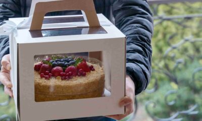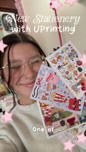
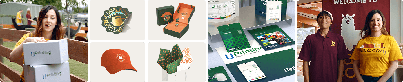
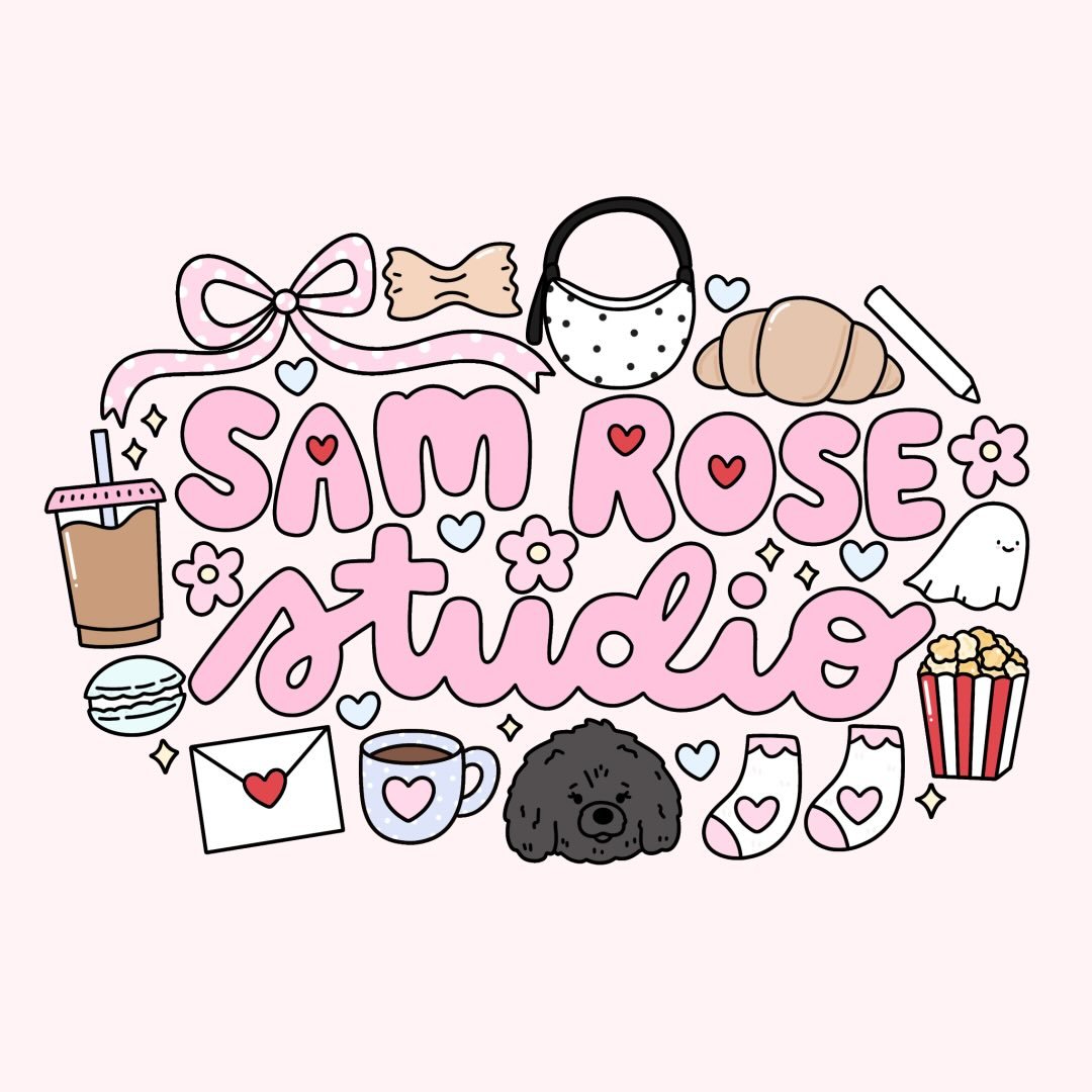
From labels to luxe packaging — @uprinting has been my go-to since day one  Bringing my rebrand to life never looked so good
#UPrinting #PrintItLikeUPrinting #PrintLikeAPro #UPrintingCommunity

 From a simple doodle to a fully printed notepad—watch my design come to life! As someone who jots down ideas constantly, having a notepad that fits my workflow is a game-changer. I designed this with my daily routine in mind—because let’s be real, my brain before coffee is a mess!
 Thanks to @uprinting , I now have the perfect notepad to keep me organized and inspired. Their printing
Unboxing our hang tags with Teddy’s sister, Delilah! Thank you @uprinting
#pregnancyloss #pregnancyandinfantloss #pregnancylossawareness #infertility #1in4 #stillborn #miscarriage #tfmr #lossmama #grief #nonprofit #atouchofteddy #unboxing
@uprinting coming in clutch with products of my DREAMSS!
INCYMI: my shop is FINALLY reopening tomorrow (on a different site) after almost two months!! I have had a MUCH needed hiatus from my business after 5 years of never taking a break longer than 3 days! Tomorrow at 7pm EST, all of these items (plus some of your old favs) will be available for purchase again!!
#partner #ad #uprinting #fyp #foryou
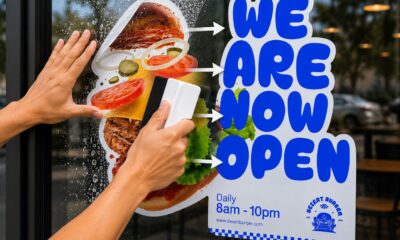
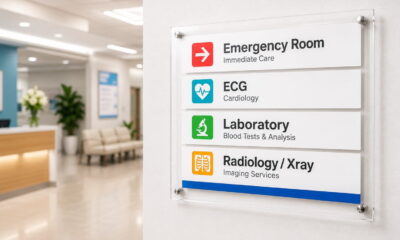
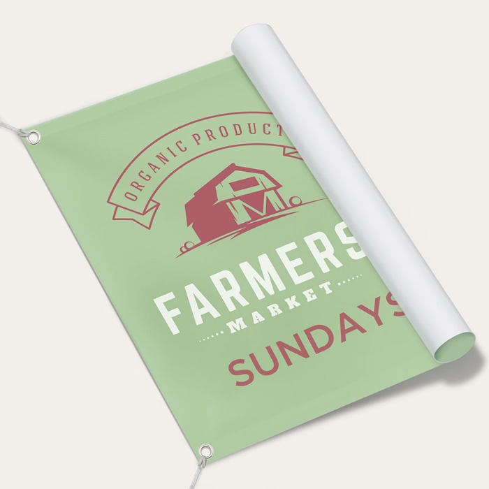
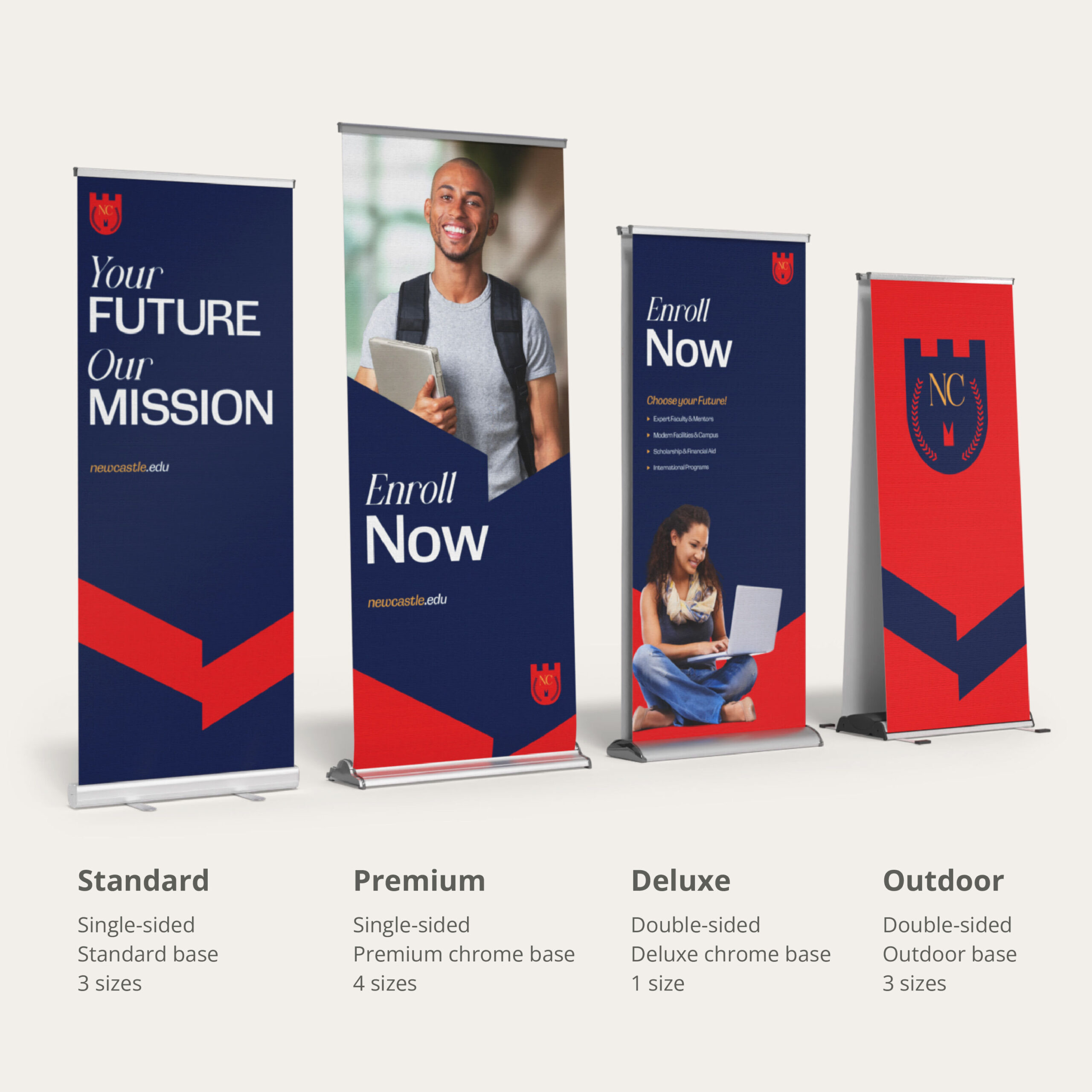
let’s hear it for the new signage
this is literally the nicest looking sign, highest quality material, and folds up SO SMALL.
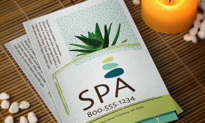
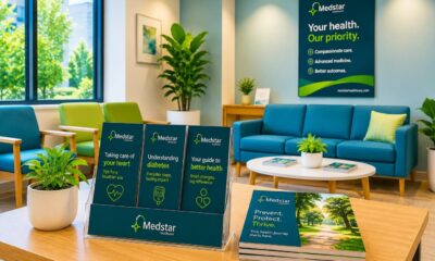
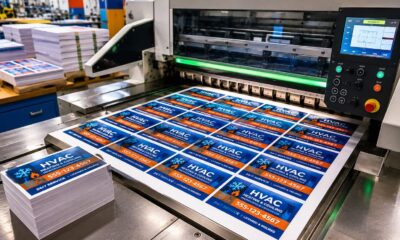
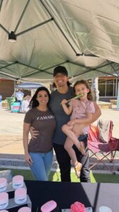
@uprinting is my go-to for small business things, events, and more
The package came SO fast & the fact we were able to figure out how to set it up so quick must count for something
Go check out @uprinting for all your printing needs
#Uprinting #Uprintingpartner #PrintitlikeUprinting #PrintLikeaPro #uprintingcommunity #smallbusiness #signage #smallbusinessowner #market #popup
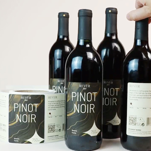

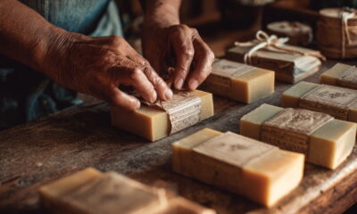
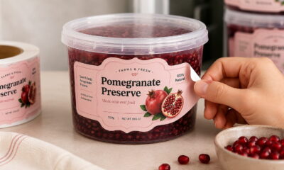
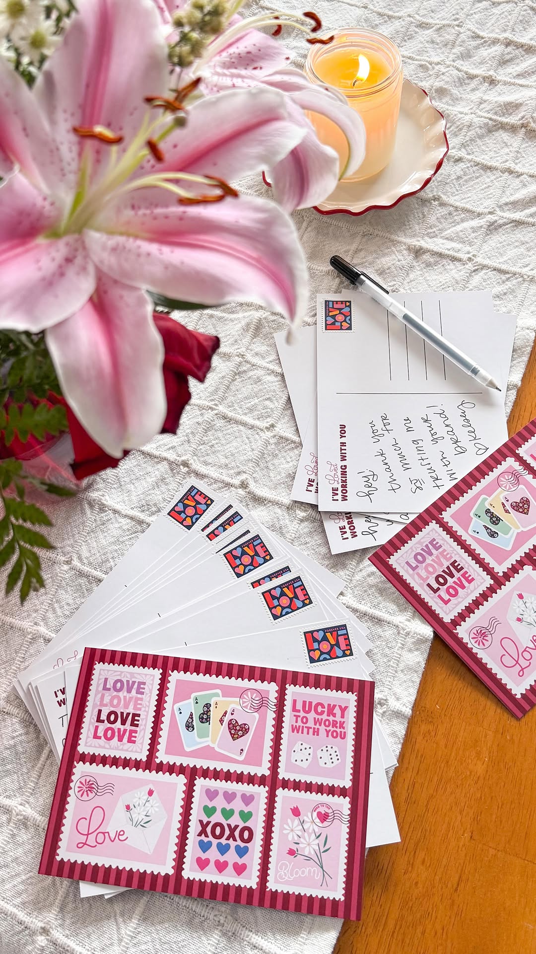
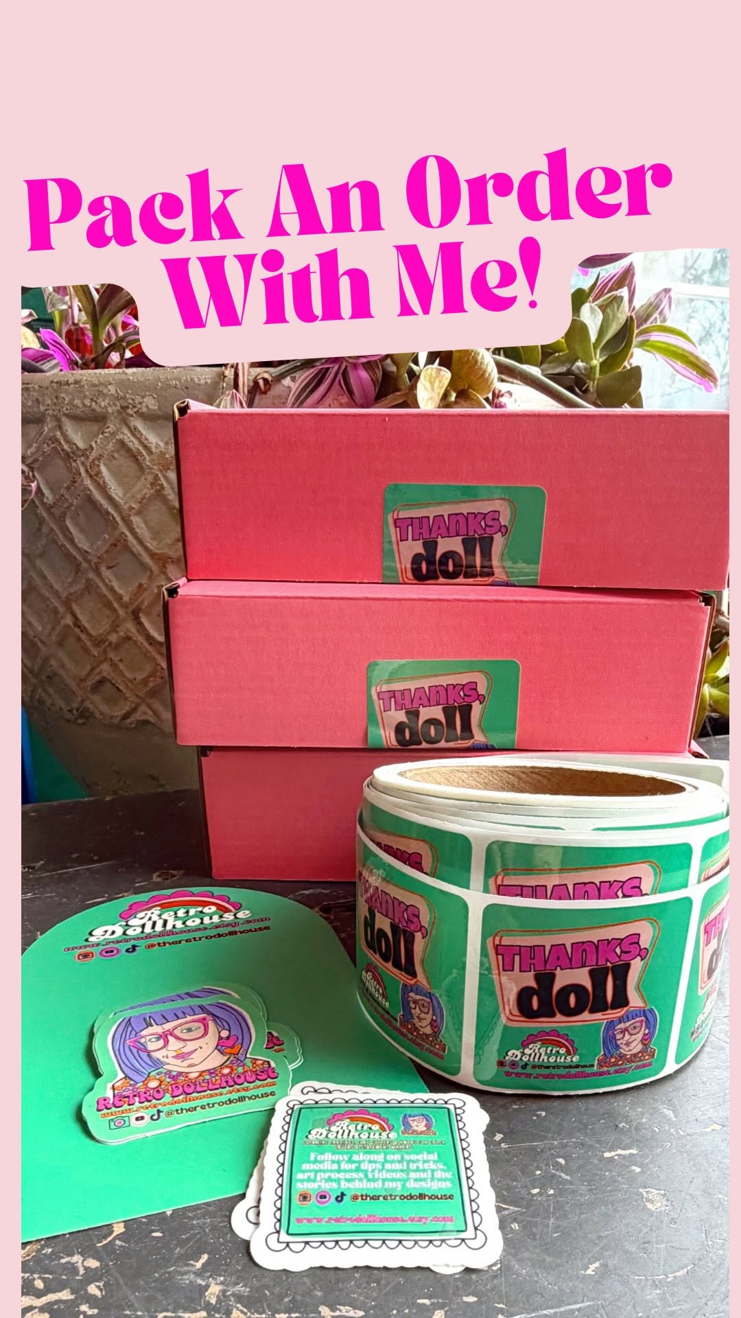
We love some new packaging supplies  Thank you @UPrinting for the super cute goodies, everything turned out perfect!
If you need any customizable package supplies or accessories for your small business, visit UPrinting.com at the link in my bio
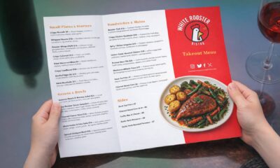
#banner #paintedbanner #SmallBusiness #unboxing #UPrinting #printlikeapro #printlikeUPrinting #UPrintingcommunity


let’s hear it for the new signage
this is literally the nicest looking sign, highest quality material, and folds up SO SMALL.
@uprinting is my go-to for small business things, events, and more
The package came SO fast & the fact we were able to figure out how to set it up so quick must count for something
Go check out @uprinting for all your printing needs
#Uprinting #Uprintingpartner #PrintitlikeUprinting #PrintLikeaPro #uprintingcommunity #smallbusiness #signage #smallbusinessowner #market #popup

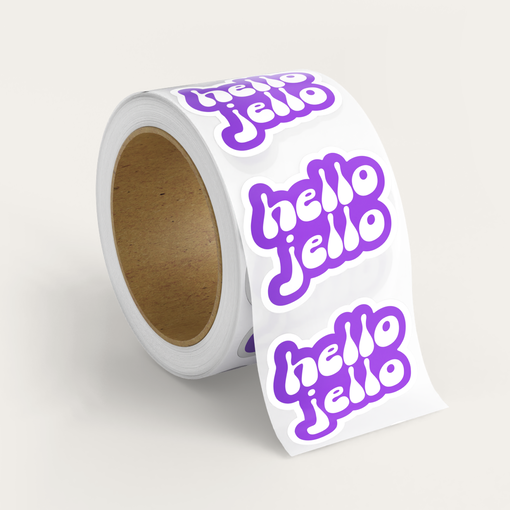
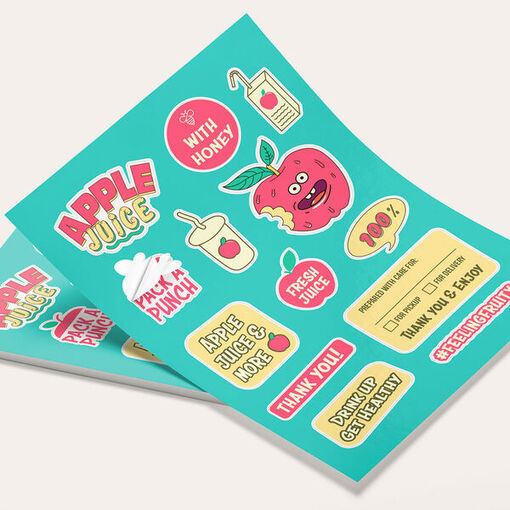
Pack an order with me! Stickers all from @UPrinting. Highly recommend!
#uprinting #uprintingcommunity #printlikeapro #customstickers #printedbyu