Business Card Fonts: What You Need to Know
Written by UPrinting | Published on November 2, 2023
A business card is a small yet effective marketing tool that helps you connect with your potential customers. If you want to leave a lasting impression and gain the trust of your target audience, creating a well-designed business card is a must.
Every element in your design, from color choices to font options, contributes to the overall impact of your brand. To help you create an eye-catching business card, here’s a quick guide to working with business card fonts.
Understanding Typography
Choosing the right font for your business card can be tricky. The font will represent your brand, give your audience an idea of what kind of business you are, and show what message you want to convey. Some companies use typical fonts such as Times New Roman, Arial, and Helvetica. While these are good and easy-to-read fonts, these do not help set yourself apart from competitors.
Use slightly different fonts for your business card to grab your audience’s attention. Fonts that can be shorter, slanted, bolder, thinner, thicker, or taller are good examples. Also, keep in mind the different rules of typography when designing your business card. These rules and terms include:
-
- Size – Since a business card is a small canvas, choose a font size that will fit the card yet make the text readable.
- Classifications – Fonts are classified into serif, sans-serif, and decorative fonts. For aesthetically pleasing results, pair serif and sans-serif fonts. Here are some combinations that work well together:
- Decorative header and sans-serif body
- Sans-serif header and serif body
- Serif header and sans-serif body
- Contrast – Contrast can help emphasize what you want to communicate. Varying colors, size, weight, and style can give your copy a more attractive appearance.
- Hierarchy – This keeps the copy organized and easy to read. It also helps direct the reader to the headers and focal point of your text.
- Leading – Also known as line height, this is the space between lines of text. Without proper spacing, large blocks of text can be challenging to read.
- Kerning – This is the space between each character. It can create a balanced appearance and helps avoid line breaks in a design.
- White Space – Also known as negative space, this is the space between compositions. It provides a pleasing visual experience and makes the canvas look uncluttered.
What is the recommended font size for business cards?
The recommended font size for a business card depends on the text field. A 10pt to 16pt font size is ideal for company names or your full name. Secondary text, such as your contact details, job title, email address, social media handles, or website, should be smaller than the primary text. The minimum size is 8pt, but you can go larger depending on your font.
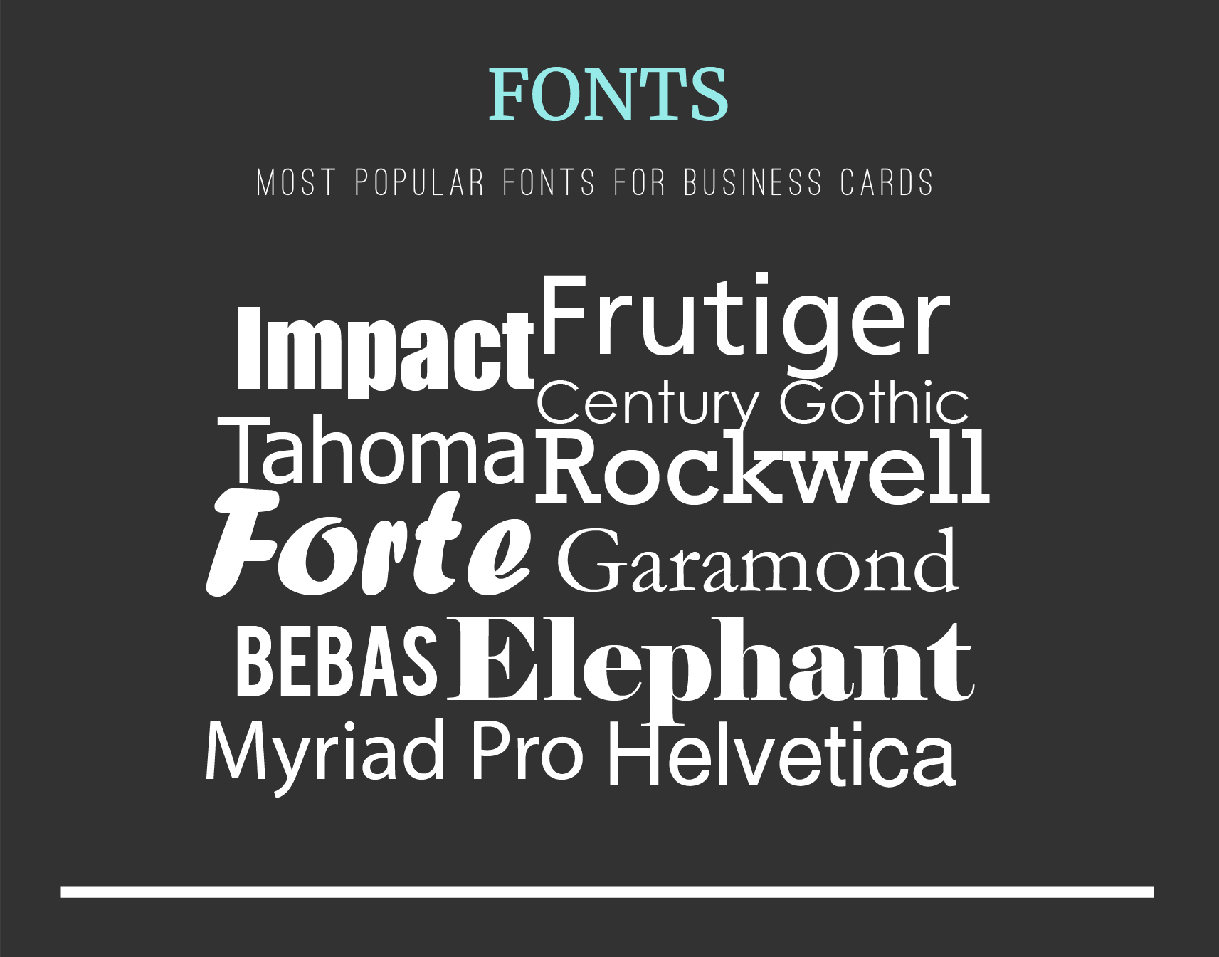
Best Fonts for Business Cards
The best font for your business card should reflect your brand’s personality. If your business is an art gallery, choose light, elegant, and thin fonts. If your business is a construction company, a bold, strong, and heavy font suggests stability and strength.
No idea about what fonts are good to use for your business card? We got you. Here are some examples to consider:
|
Font Type |
Style |
|
|
|
|
Baskerville |
|
|
Times New Roman |
|
|
Myriad Pro |
|
|
Leyton |
|
Futura  |
|
|
|
|


Other Recommended Fonts
-
- Proxima Nova
- Museo Sans
- Museo Slab
- JAC Facit
- Raleway
-
- Vinyl
- Brandon Grotesque
- Foco
-
- FF Cocon Pro
- Omnes Pro
- Salsbury
-
- JAF Bernino Sans Condensed
- Prenton Ultra Condensed
- Franklin Gothic URW Extra Compressed
-
- Nasalization
- Tachyon
- Automate
-
- Omnes Pro
- Futura PT
- Learning Curve
-
- Brioso Pro
- Abril Display
- Garamond Premiere Pro
-
- Futura PT (heavy)
- LFT Etica Display
- Ratio
Pairing Fonts for Your Business Card
One way to elevate the visual appeal of your business card is to pair different fonts. Here are some tips to consider when using fonts:
• Narrow down your choices to two fonts. Using more than two can make your business card look cluttered• Create a visual hierarchy to organize your business card layout. Your name or business name should be the focal point, while your contact details should be in a smaller font.
• Pair a sans-serif font with a serif font. This adds variety to your visual design.
• Use different weights (bold, italic, regular). This emphasizes important details.
• Don’t pair similar fonts. It won’t make the text noticeable or emphasize what you want to communicate.
• Add contrast between elements like the text and background to make the text stand out.
Conclusion
To create an impactful business card, strategically choose the right fonts. A business card also doesn’t always have to follow the traditional route. You can also turn your design into something playful, friendly, and professional to get noticed by your prospects.
As long as your business card is well-designed, appropriately sized, and aesthetically pleasing, you’re sure to gain the trust and confidence of your target market. To get started on creating custom business cards, you can upload your design to UPrinting’s website or try downloading our free design templates.

Business Cards
Learning Center Home
Other Topics
- Best Ways to Repurpose Old Business Cards
- Standard Business Card Sizes
- The Ultimate Guide to Essential Business Card Information
- Business Card Fonts
- 10 Parts of Modern Business Cards
- UPrinting's Guide to Designing the Perfect Business Card
- Business Marketing 101: From Business Cards to Websites
- A Beginner's Guide to Making a Business Card