

 3.5" x 2"
Business Card
Choose a Business Card Size
17 pt
10 pt
10 pt
10 pt
9 pt
Font Family
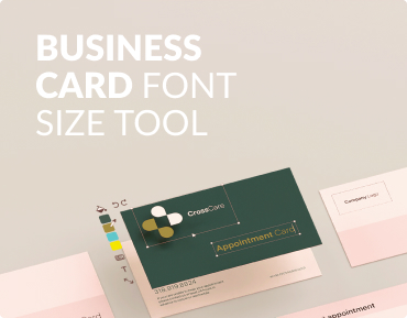
Business Card Font Size Tool
Our tool to help you gauge font size and distance
What Is the Best Font Size for Business Cards?
The best business card font size is 10–12 pt for your name and 7–9 pt for contact information. To ensure readability, choose a clean serif or sans-serif font and use visual hierarchy and high-contrast colors. Modern trends like accessibility and eco-friendly papers may call for slightly larger or bolder fonts. Nearly 100 billion business cards are printed each year, with the United States alone producing about 10 billion. Creating
How to Use UPrinting's Business Card Font Size Tool
Choosing the right font size for your business card is crucial for
creating a professional and readable design. But what size do you
need for each line? Our business card font size tool helps you
easily determine the ideal font sizes for various elements of your
card.
This guide will walk you through using the tool and provide best
practices for selecting font sizes and styles to make your business
card stand out.
The Business Card Font Size Tool: A Step-by-Step Guide
Type the information that you want on your business card into the designated fields. You can add details such as your name, title, phone number, email, and address. Once you’ve entered the text in the corresponding fields, use the font size adjustment options to change the size of each text element. This allows you to see how different sizes look on your card. After adjusting the font sizes, preview your business card to see how it looks. This step helps you ensure all text is readable and easy on the eyes. Once satisfied with your design , you can export or save it. This feature allows you to download your design for printing or save it for future reference.
Enter
text
Type the information that you want on your business card into the designated fields. You can add details such as your name, title, phone number, email, and address.
Adjusting font
sizes
Once you’ve entered the text in the corresponding fields, use the font size adjustment options to change the size of each text element. This allows you to see how different sizes look on your card.
Previewing the
business card
After adjusting the font sizes, preview your business card to see how it looks. This step helps you ensure all text is readable and easy on the eyes.
Exporting or saving
the final design
Once satisfied with your design, you can export or save it. This feature allows you to download your design for printing or save it for future reference.
What are the font sizes to use in a standard business card size
| Business Card Elements | Recommended Sizes |
|---|---|
| Name | 10pt -12pt |
| Title | 8pt -10pt |
| Phone | 8pt -10pt |
| 8pt -10pt | |
| Address | 7pt -9pt |

What Are the Best Fonts for Business Cards?
Serif fonts have small lines or strokes at the ends of letters. They are traditional and professional, suitable for many industries. Popular serif fonts include Times New Roman, Georgia, and Garamond. Sans serif fonts do not have the small lines at the ends of letters, making them clean and modern. They are versatile and easy to read. Common sans serif fonts include Helvetica, Arial, and Verdana. Display fonts are decorative and used for impact. They are best for names or titles, but should be used sparingly to avoid clutter. Examples include Lobster and Pacifico.
Standard/Popular Fonts to Use in a Business Card

Serif fonts have small lines or strokes at the ends of letters. They are traditional and professional, suitable for many industries. Popular serif fonts include Times New Roman, Georgia, and Garamond

Sans serif fonts do not have the small lines at the ends of letters, making them clean and modern. They are versatile and easy to read. Common sans serif fonts include Helvetica, Arial, and Verdana.

Display fonts are decorative and used for impact. They are best for names or titles but should be used sparingly to avoid clutter. Examples include Lobster and Pacifico.
Business
Card
Best Practices for Business Card Font and Size Design
Prioritize Readability and Legibility
You can do this by choosing clear fonts and appropriate sizes. Ensure all information is easy to read.
Think About Font Hierarchy and Visual Appeal
Varying font sizes and weights creates a visual hierarchy. Larger or bolder fonts highlight important information, such as your name and title.
Use Color Contrast
Take advantage of different hues to make your text stand out against the background. Dark text on a light background or vice versa works best.
Avoid Visual Clutter
Keep your design simple and avoid overcrowding your card with too much text or decorative elements. This helps maintain a professional look.
Use White Space
White space (or negative space) is the empty area around text and images. Using white space effectively can enhance readability and make your card look clean and organized.
What Trends Are Shaping Business Cards Now?
One of the best ways to stay ahead of the competition is to keep up with modern trends. Let’s explore some of these:
Digital First Business Card Tools
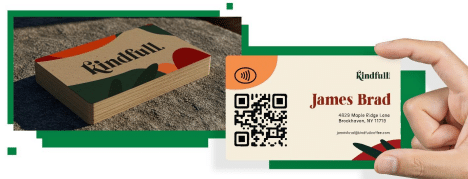
Many professionals now complement printed cards with QR codes. When including QR codes, designers must balance spacing so the text remains legible. Ensuring adequate white space around the code using slightly larger fonts helps maintain legibility even as some attention shifts to digital links.
Inclusive, Accessible Typography
There’s growing awareness that small text should remain legible to people with visual impairments. A movement towards a minimum font size of 9 pt, paired with high- contrast colors, is becoming standard practice. This improves accessibility for a wider audience.
Eco-Friendly Materials and Coatings
Sustainable cardstock and water-based inks can slightly affect print sharpness. Designers now account for this by favoring bolder weights and slightly larger point sizes to compensate for potential ink diffusion on porous, recycled stocks. An effort to increase sustainability can have a strong positive impact on your brand image.

frequently asked questions
The recommended size for an address, the smallest element, is between 7pt and 9pt. However, for better accessibility, there is a growing movement towards using a minimum font size of 9pt for all text to ensure it remains legible for people with visual impairments. Ultimately, prioritizing readability is a key best practice.
Yes, using different font styles is a great way to create a visual hierarchy. For example, you can use a decorative display font for your name to create impact and a clean sans serif or traditional serif font for your contact information. It is a best practice to use display fonts sparingly to avoid a cluttered design.
The material of your business card can impact print sharpness, especially with eco friendly or recycled stocks, which can be more porous. To compensate for potential ink diffusion on these materials, designers often favor bolder font weights and slightly larger point sizes to ensure the text remains clear and sharp.
When including a QR code, you must carefully balance spacing to keep your text readable. You should ensure there is adequate white space around the QR code. Using slightly larger fonts for your contact details can help maintain legibility when some of the card's space is dedicated to the scannable code.
Creating Your Business Cards
Choosing the right business card font size takes more than just
following a standard template. It’s about balancing clarity,
hierarchy, design, and the medium you’re printing on. A card
that’s easy to read and thoughtfully designed leaves a stronger
impression and ensures your contact information is never
overlooked.
UPrinting is dedicated to producing the
highest-quality printed materials. More than 1 million business
professionals trust us with their printing, and we offer more
than a thousand customization options, allowing you to create
something truly unique.
Check out our
business card solutions
now and start making impressive connections!


