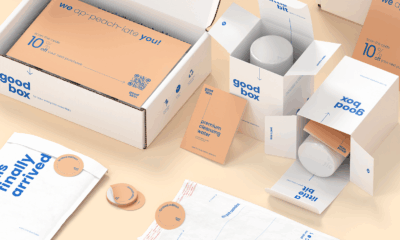
Choosing the right mailer box starts with knowing what each material brings to your branding and unboxing experience. Standard White is the most economical option and delivers a crisp, uncomplicated look that suits modern or minimal layouts. Premium White levels up presentation with richer color output and sharper details, making it ideal for beauty, luxury, and PR-focused packaging. Kraft Brown leans into sustainability and texture, giving products an organic, handmade feel that resonates with eco-forward audiences.
Each material prints differently, influences how customers perceive your brand, and plays a role in how polished your packaging appears. Understanding the strengths of each stock helps you make a smarter choice before production begins.
Mailer Box Materials Explained
Most custom mailer boxes fall within three material categories, each offering a distinct surface quality and printing result. This material keeps visual impact neat and consistent without raising your packaging budget.
Standard White (Matte Ink, HD Print)
Standard White is the most affordable stock.
- Great for clean, simple artwork and brands that prefer muted, soft tones
- Features a lightly absorbent surface that reduces color intensity
- A solid choice for apparel, basic branding, or cost-conscious projects
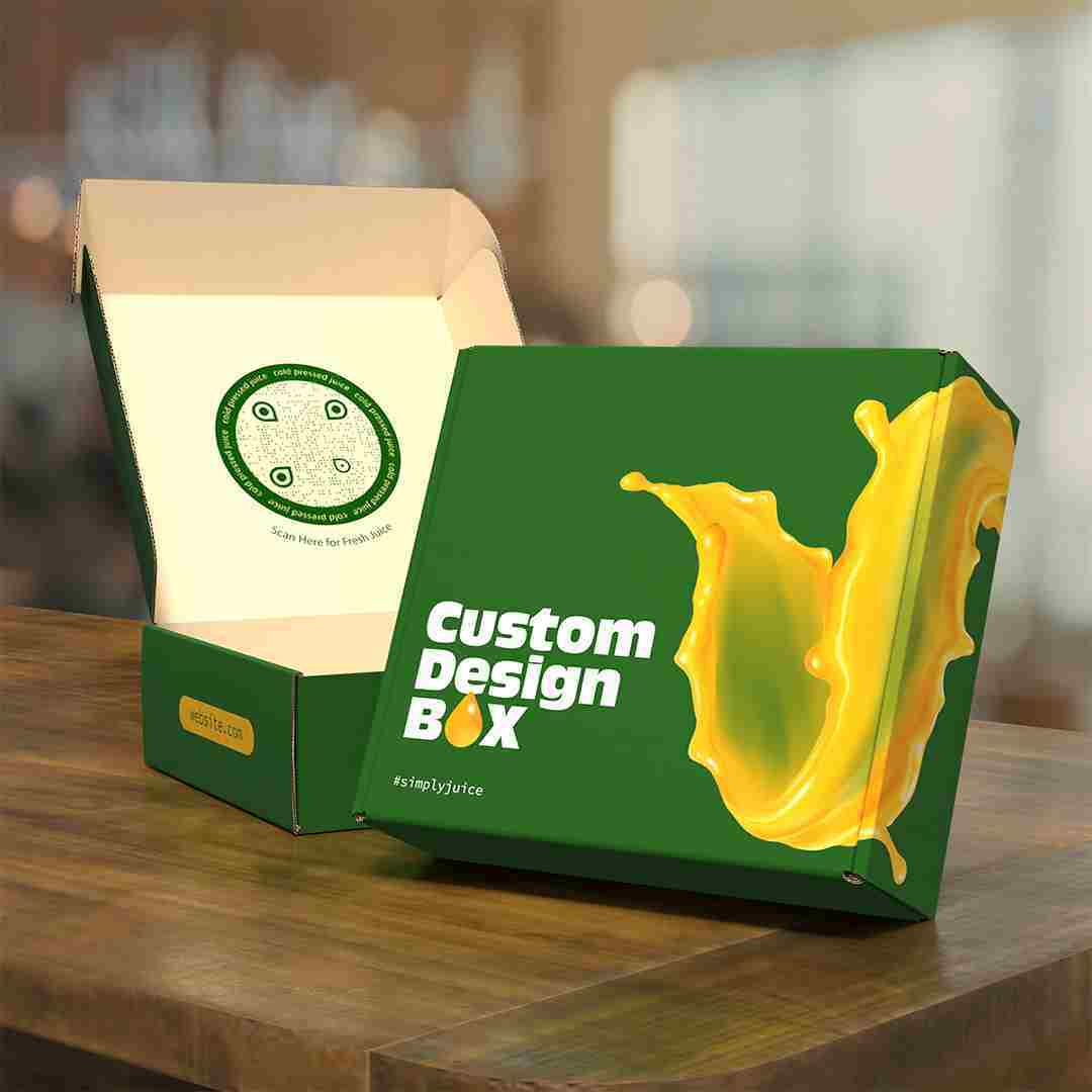
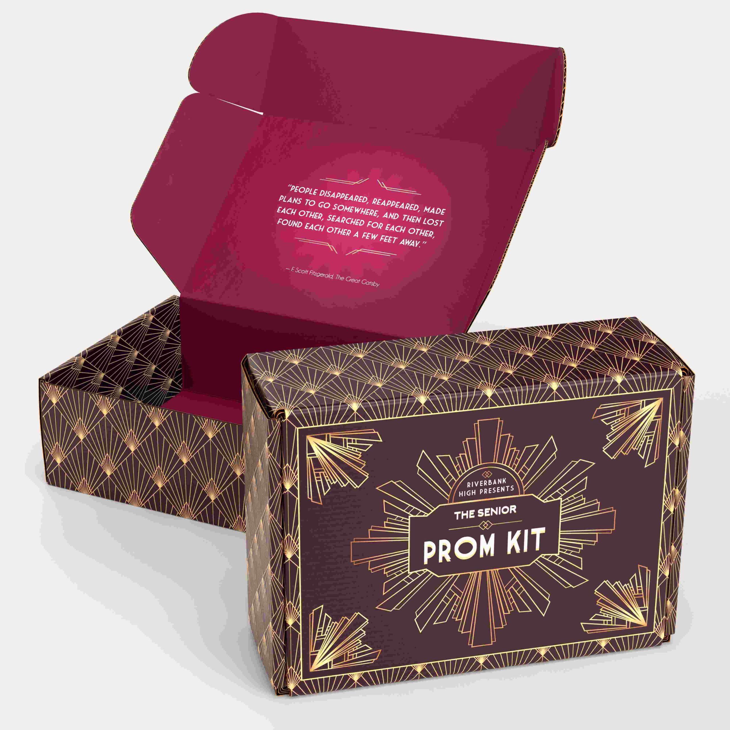
Premium White (Satin Ink, HD Print)
Premium White provides a bright, smooth surface that enhances detail. Choose this stock when presentation is part of the product experience.
- Suited for high-end visuals, beauty products, or promotional kits
- Produces richer colors and increased clarity in gradients, photography, and fine lines
- Ideal when the box needs to capture attention on camera or elevate perceived value
Kraft Brown (Matte Ink, HD Print)
Kraft Brown highlights a natural and grounded aesthetic. It is best when sustainability or an artisanal personality is central to your brand.
- Works beautifully for organic, handmade, or sustainable brands
- The visible fibers soften colors and complement simple illustrations or black ink
- Creates a warm, rustic unboxing moment that feels authentic and intentional

Compare Mailer Box Materials at a Glance
| Feature | Standard White | Premium White | Kraft Brown |
|---|---|---|---|
| Look & Finish | Clean, matte | Bright, smooth, satin | Natural, rustic |
| Print Quality | Good, slightly muted | Excellent, highly detailed | Soft, textured |
| Best For | Budget-conscious brands, apparel, simple designs | Beauty, PR kits, luxury items | Organic, handmade, eco-driven brands |
| Cost Effectiveness | Most cost-effective | Higher cost | Moderate |
| Color Accuracy | Fair | Best | Fair to moderate |
| Unboxing Appeal | Simple and clean | High-end and photogenic | Warm and earthy |
Choosing the Right Flute Thickness (E-Flute vs. B-Flute)
E-Flute (1/16”)
E-flute has a slim profile that creates clean edges and a more refined look. It’s great for lightweight items like cosmetics, accessories, and small subscription boxes. The smoother surface also supports more detailed printing.
B-Flute (1/8”)
B-flute is thicker and sturdier. It protects heavier or fragile items and performs better when boxes face rough handling during shipping. Food kits, snack boxes, and multi-item packages usually rely on this option.
When to Let Your Printer Choose vs. When to Specify
If you’re not sure which flute to use, most printers default to E-flute for standard products because it looks polished and prints well. Specify B-flute when the box carries more weight, includes breakables, or needs the extra durability. Requesting a sample helps you compare both options more confidently.
Industry-Specific Mailer Box Recommendations
Beauty & Skincare Brands
Beauty and skincare products benefit most from Premium White with satin ink because it brings out crisp details and vivid colors. This material handles photography, gradients, and fine patterns well, so your packaging looks polished on camera and in person. Adding inside printing can elevate the unboxing experience, especially for brands that rely on presentation.
Clothing & Apparel
Most apparel brands can stick with Standard White, which keeps costs controlled while still providing a clean look. Eco-focused labels often prefer Kraft because it aligns with their sustainability message. Larger panels on apparel mailers make it easy to use bold logos or simple repeating patterns without overwhelming the design.
Food & Beverage / Snacks
Food and snack boxes usually need more durability, so B-flute is the safer choice. If your design uses heavy or highly saturated colors, white stocks will handle them better since kraft can mute or shift tones. For boxes with multiple or unevenly weighted items, adding tape or inserts helps keep everything secure during shipping.
Subscription Box Services
Subscription boxes need to balance appearance and strength, which is why E-flute works well for most services. Inside printing can turn the unboxing into a branded moment that subscribers remember. Standard White is a good starting point for new subscription brands, while Premium White offers a more polished look once the brand is established.
Wellness, Organic, or Sustainable Brands
Kraft is the natural fit for wellness and eco-focused brands because it reflects the values and tone of the products inside. These brands often lean toward minimal ink to keep the design clean and authentic. Stamped graphics or small-format illustrations also pair well with kraft’s earthy texture.
PR Kits & Influencer Boxes
PR and influencer boxes perform best with Premium White and satin ink because they photograph cleanly under different lighting conditions. High-detail artwork, clean typography, and bold color fields look sharper on this material, making the box more appealing in social content. Adding interior print or message panels increases shareability and helps guide the storytelling when the box is opened on camera.
Final Thoughts
The best mailer box depends on your brand identity and your product’s shipping needs. White stocks offer crisp, clean printing, while Kraft gives you a warm, sustainable feel. Flute thickness determines how well the box performs in transit. The safest approach is to test materials before committing, especially if color or texture is important to your brand.
If you’re ready to create your own, start customizing your mailer box with UPrinting and see which material fits your vision.