Creating a brand does not just mean designing visuals for looks; it’s also about building recognition. You can have a stunning logo, beautiful packaging, eye-catching images, and clever social media posts. However, if your branding doesn't match your website or print materials, the best ideas can fall flat, and you'll lose credibility fast. So, how can you maintain brand consistency across all platforms? Read on as UPrinting shares tips for designers and entrepreneurs to build trust and make your brand unforgettable, whether on packaging, print, or social media.
What Brand Consistency Really Means (and Why It Matters)
Branding consistency means presenting your brand in the same way across every platform, whether offline or online, in print, on packaging, or on the web. This usually includes various components of your brand, from your logos, colors, and fonts to the tone and material you choose.
But what happens when branding is inconsistent?
For example, if your Instagram post uses colors that don't match your brand, your print marketing materials use different fonts, and your website has another logo that can't be seen on other platforms, you can expect your audience to:
- Be confused and think you're three different brands
- Question your credibility and professionalism
- See your promotions as low-impact or invaluable
When customers see your brand, they should recognize it immediately—and that's what consistency does. It reinforces who you are while creating a seamless, polished experience that builds trust.
Branding consistency means presenting your brand in the same way across every platform
8 Tips for Consistent Branding Across Marketing Materials
Branding consistency does not have to be complicated. Follow these tips to help align your designs, messaging, and materials to make your brand cohesive and seamless:
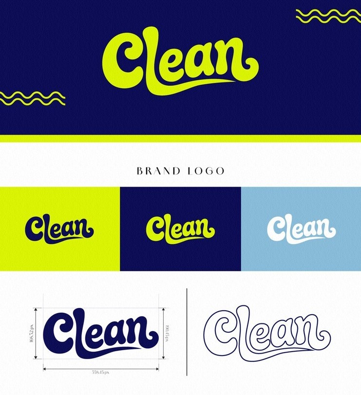
1. Start with a simple brand kit.
Famous brands like Netflix, Apple, and Spotify are just some of the many companies that use brand kits to ensure consistent branding. A brand kit is an essential collection of assets and guidelines that helps maintain consistency across all platforms. It contains various elements that define a brand’s visual identity and keep everyone involved — whether designers, collaborators, or printers — on the same page when creating online or offline material.
Your booth space may be limited and renting a larger one can be costly. To save on additional costs, use materials that maximize your visibility without taking up too much space.
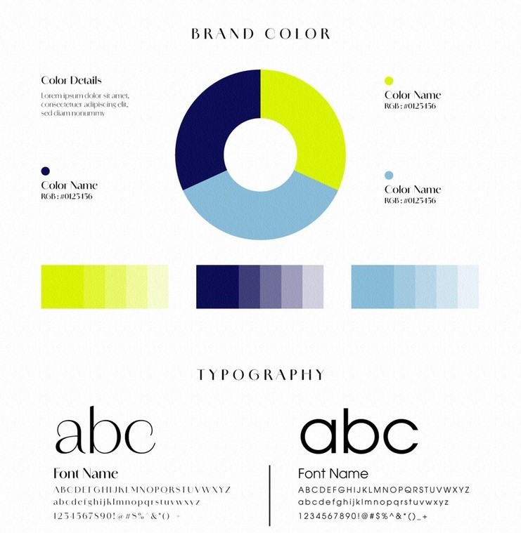
Here’s what you should include in your brand kit:
- Variations of your logo (full color, black and white, icon only, watermark)
- Your brand’s color palette (primary, secondary, accent colors, neutral shades with CMYK and HEX codes for print and digital platforms)
- Typography (what font types to use, and the hierarchy for headlines, subheads, or body)
- Imagery (photography style, lighting tone, texture references)
- Layout examples for print materials, social media, or emails)
- Tone of voice (language use)
- Best practices to follow
Using a brand kit as your foundation saves you time because all the assets you need are in one place. Most importantly, it shows that your designs belong to the same brand family and won’t cause any confusion for your customers.
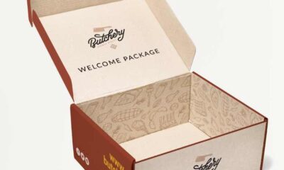
2. Align physical and digital branding.
Your brand kit was created for a reason: to encourage brand recognition from unboxing to Instagram follow.
Your packaging and digital marketing should feel like siblings—resonating with and connecting to your audience, not feel disjointed.
That is why it’s essential to use the same logos and color palettes across every platform.
Brands like Pepsi and Coca-Cola are such examples, with both incorporating their logos and product packaging colors to encourage brand recognition in their Instagram posts, even in the most subtle ways.
3. Maintain a visual hierarchy.
Repetition is key to branding consistency — and that includes visual hierarchy in your design. For example, use the same header sizes, whether you’re creating content for print or digital platforms. Make sure call-to-action buttons and images are placed in familiar places, and use the right margins, bleed, trim, and spacing on all templates.
For better results, save grid systems and spacing rules as presets in your design files for effortless structure and alignment.
Repetition is key to branding consistency
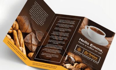
4. Create reusable templates.
Templates are one of the simplest and easiest ways to ensure your content remains consistent. Creating templates for print, email, social posts, and packaging saves you time, streamlines the design process, and makes sure every aspect of your content stays on-brand.
When setting up pre-made templates, remember to include:
- Branded frames and color blocks to keep layouts structured
- The same typography for all forms of text
- Customizable, flexible layouts for updating images or text when needed
Additionally, reusable templates can reduce the need for revisions, speed up approvals, and make updating assets a breeze thanks to their customizable elements.
5. Keep your brand tone consistent.
Branding is not just all about your design; it also involves the voice and tone that you use. For example, suppose your email copy is fun and playful, but your website and social media posts are formal and professional. In that case, your content might not resonate with your target audience and only confuse them about who you are. Consider your voice and tone as your brand’s personality; your customers should feel familiar with your brand whenever they interact with it.
Here’s how you can maintain a unified voice:
- Decide and define your brand voice. Are you going for formal, professional, or fun and playful?
- Use the same tone and voice in all assets, including social media posts, promotional tools, signs and banners, packaging, websites, and emails.
- Keep the vocabulary and style consistent. For example, you can’t use technical terms or a professional tone if you’re going for a casual and playful approach in your content.
Even the most minor adjustments, like your call to action or greeting, can affect how your brand is recognized. Consider using a style guide for your brand voice so that everyone writes with the same tone and vocabulary.
6. Balance creativity with consistency.
Yes, applying the same branding elements contributes to branding consistency, but did you know you can still get creative while doing so?
Airbnb global olympic partnership
Don’t hesitate to experiment a little with textures or imagery but stay within structure by working with your brand’s color palette, logo, and tone. Take, for example, Google and Airbnb. These brands feature variations and creative styles of their logos and icons in their collaborations, while maintaining the same logo shape or color palette.
7. Print with intention.
Your print materials can also say a great deal about your brand. When selecting materials and finishes, choose those that match your brand personality.
Check out our recommendations below:
- Organic, eco-friendly, artisan brands – Kraft paper, textured stock, matte finishes
- Modern, high-end brands – Premium coatings, foil accents, glossy finishes
- Minimalist brands – Choose clean, uncoated papers or subtle colors
Whether you’re designing promotional products or packaging, keep in mind that your audience’s first physical impression starts when they see and feel the quality of the material you choose. To get a better idea of what material or finish is right for your brand, order printed samples to ensure they match the visuals you’re opting for.
8. Organize your brand assets.
Maintaining consistency is hard when your files are unorganized across devices and platforms. To keep your brand assets organized, build a clear, shareable system that you, your team, or collaborators can easily access for storing and naming files.
Follow this quick guide:
- Create a main folder and categorize them based on the type of asset (e.g. Logos, Templates, Fonts, Photos, etc.)
- Use simple and understandable labels for each file, e.g. ”Logo_Primary.png”
- Save your files to your computer or in storage clouds, such as Google Drive or Dropbox
- Back up your files every quarter to ensure there are no duplicates and to prevent data loss
Whether you’re working solo or with a team, having shared access helps in keeping branding aligned. When your assets are organized, you won’t have any trouble finding files; no assets will get lost in the cloud, and there’s no need to guess which is the right one to use.
Designer-Friendly Tools and Resources
Ready to start designing? Check out these resources to streamline your branding workflow:
- Canva – Perfect for creating reusable templates, brand kits, and quick mockups.
- Figma Variables + Libraries – Recommended for designers managing multiple design systems.
- Google Drive Asset Hubs – Stores files online, keeps them accessible for everyone and synced in real time.
- Adobe Libraries – Syncs brand assets across all Adobe apps like Illustrator, Photoshop, and InDesign.
How to Make Consistency a Habit
Consistency starts with practicing small habits in your routine. Here's how to make it happen:
- Do regular brand check-ins by setting aside 1 hour each week to audit materials, templates, and assets, and keep them organized.
- Double-check all print colors to ensure they match digital ones.
- Ensure your email footer has accurate social media handles.
- Document updates using a change log to keep everyone in the loop and remember which edits or tweaks were made to your brand kit.
Strong brands aren't built overnight; they're built through consistency. When every detail about your brand aligns across all platforms, customers are more likely to trust you and recognize you. Remember to follow our tips, take time to standardize your materials, and refine your brand kit so you can design faster, collaborate more effectively, and maintain a polished and professional brand look.
Want more tips? Browse our page for more articles on packaging, branding, and visual strategy to keep your creativity and consistency thriving.