In 2025, the most recognizable brands aren’t just the loudest.; Tthey are the most consistent.
Designers today face the challenge of scaling their work across print, digital, packaging, and social media while keeping everything cohesive and relevant. Whether you’re refining an established identity or building one from scratch, staying on-brand is what builds trust, recognition, and premium appeal.
But what does “on-brand” actually look like right now? Here are five brands that set the standard for staying on-brand in 2025 — and what every designer can learn from them.
Notion: The Power of Modular Design
Notion’s visual identity proves that flexibility can still look refined. From its monochrome palette to its geometric logo and typography, every asset feels part of the same system. The brand’s print materials, like event posters and product booklets, follow a clear grid structure that mirrors its minimalist app interface.
Why It Works
- Strong hierarchy and negative space create instant recognition.
- The grid system makes scaling and adaptation effortless.
- Minimalism emphasizes clarity and purpose.

Designer Takeaway
Build a design system that can grow with your brand. Establish consistent spacing, typography, and color logic, so every print piece aligns with your digital assets. Precise printing and consistent proofing keep your materials looking as intentional as your design system.
Aesop: Luxury Through Restraint
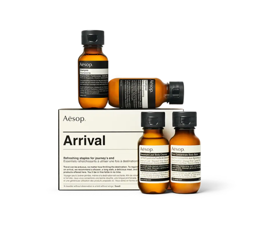
Aesop’s packaging and collateral are a masterclass in quiet luxury. Each bottle label, shopping bag, and printed card speaks in the same tone — minimal, confident, and timeless. The brand relies on high-quality materials and simple typography instead of flashy graphics to communicate its premium positioning.
Why It Works
- Neutral tones and structured type convey elegance and trust.
- Consistent material quality reinforces brand value.
- Simplicity highlights the sensory quality of the product itself.
Designer Takeaway
Premium branding does not need complexity. Use texture, paper weight, and finishesfinish to let the design breathe. When you choose thicker stocks or tactile coatings, you help minimalism speak louder than color or clutter.
Stripe: Bold B2B With Personality
Stripe’s rebrand redefined what a tech-finance company can look like. Its print materials, from brochures to trade show kits, use confident gradients, geometric patterns, and precise typography to create energy and professionalism at once.
Why It Works
- A unified visual system ties color and data motifs together.
- The balance of structure and vibrancy feels both innovative and trustworthy.
- Typography and layout mirror the rhythm of the product experience.

Designer Takeaway
Give B2B materials visual confidence. Pair clear grids and sharp typography with expressive color or pattern systems to stand out without losing credibility. High-quality paper stocks and crisp color reproduction help the visuals translate consistently from screen to print.
Patagonia: Sustainability as Identity
Patagonia’s branding is inseparable from its mission. Every printed tag, catalog, and box reinforces its values through understated design and eco-friendly production. The brand’s commitment to recycled paper stocks and minimal ink use makes every piece feel purposeful and aligned with its environmental stance.
Why It Works
- Material choice becomes part of the story.
- Consistent earthy tones reflect outdoor authenticity.
- Simple layouts emphasize function and sustainability.
Designer Takeaway
Align your design choices with your message. Let materials, texture, and print technique communicate what your brand stands for. Eco-friendly stocks and low-impact inks allow your design integrity and sustainability goals to work together.
Glossier: Personalization and Play
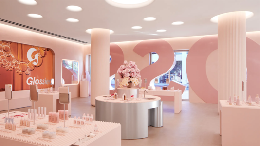
Glossier’s branding thrives on community and individuality. Its mailers, postcards, and pop-up signage feel soft, approachable, and human. The brand plays with subtle shifts in tone and typography while maintaining a clear identity centered on pink hues, rounded fonts, and candid photography.
Why It Works
- Consistent color and tone create immediate familiarity.
- Friendly typography and white space reflect inclusivity.
- Limited editions and personalization deepen brand connection.
Designer Takeaway
Make your audience feel seen. Use color, copy, and layout as tools for emotional connection, not just visual consistency. Personal touches like custom inserts or thank-you cards keep the print experience personal and memorable.
Cohesion Is the New Currency
Design trends evolve, but brand cohesion always wins. The strongest brands of 2025 don’t just repeat visuals. They build adaptable systems that translate across every touchpoint. Whether you’re refining minimal luxury like Aesop or championing sustainability like Patagonia, consistency turns good design into a lasting brand experience.
Every detail, from stock choice to color accuracy, affects how your audience perceives your brand. The right print partner helps ensure those details stay true to your vision, so your designs look and feel consistent everywhere they appear.

