The Americans with Disabilities Act (ADA) is a civil rights law that protects the rights of individuals with disabilities in public and private places open to the public. These spaces are legally required to use signs that are visible and accessible to everyone, including wheelchair users and people with low vision and other types of visual impairment.
Signages for businesses, government facilities, and public spaces must meet the ADA standards to help ensure accessibility and inclusivity to people with disabilities and to avoid hefty fines and penalties.
What are ADA-Compliant Signs?
ADA-compliant signs have specific design features and placement that make them legible and understandable for people with visual impairments.
Commercial and public spaces must have ADA-compliant signs in these key areas:
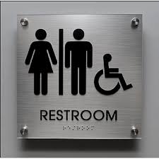
Restrooms
Parking areas
Exit and emergency routes
Elevators
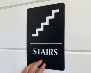
Stairways
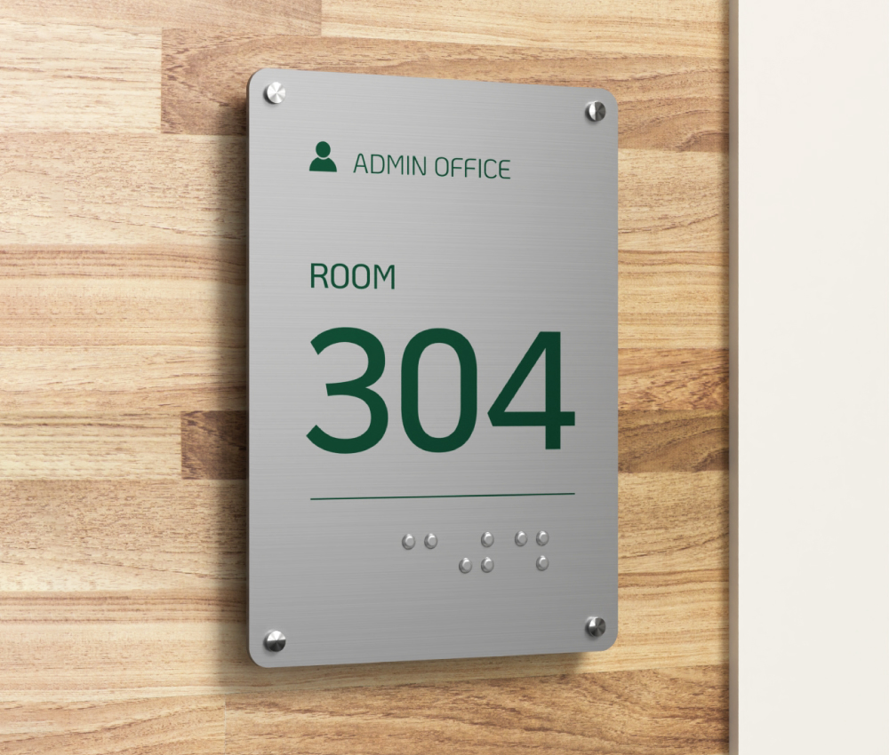
Room identification
Doors
Transportation facilities
Check-out aisles
Waiting areas
Public telephones
Amusement parks
Ramp and wheelchair access
Key ADA Signage Requirements
One of the primary goals of the ADA is to standardize signs by making them legible and universally understood by people with disabilities. Thus, ADA-compliant signages have these key features:
1. Raised characters
The characters (letters and numbers) should be raised at least 1/32” to allow reading by touch. In addition, the minimum height of characters is based on their height above the finish floor and the horizontal viewing distance.
| Height | Viewing Distance | Minimum Character Height |
|---|---|---|
| 40″ to 70″ |
|
|
| Above 70″ to 10′ |
|
|
| Above 10′ |
|
|
2. Tactile text
Braille, a tactile writing system used by visually impaired individuals to read, should be located directly below the text. Tactile requirements apply to these signs:
- interior and exterior signs identifying permanent spaces – door labels at exit passageways, stairways, and discharge;
- rail station identification signs at entrances and platforms; and
- labels for floor levels, emergency communication devices at elevators, and car controls.
3. High contrast
A high contrast between the text and the background can promote excellent readability. Black text on a white background is a great example of this. Characters that contrast with their background by at least 70% are more legible than characters with a lower contrast ratio.
4. Non-glare finish
A flat, non-reflective finish makes a sign readable under various lighting conditions.
5. Simple and readable fonts
Sans serif fonts are an excellent choice because they don’t have small strokes or extensions at the end of letters, making them easy to read. By contrast, cursive, italic, unusual, and decorative fonts are avoided.
6. Pictograms
Signs with graphic symbols that designate permanent rooms or spaces should have braille characters directly below the pictogram field. They should be at least 6 inches in height, have a non-glare finish, and possess a high color contrast with their background
7. Clear and consistent layout
Signs should have their elements arranged based on the order of importance so people can understand the message easily.
These standardized features are designed to promote safety and ease of navigation to everyone, including individuals with disabilities.
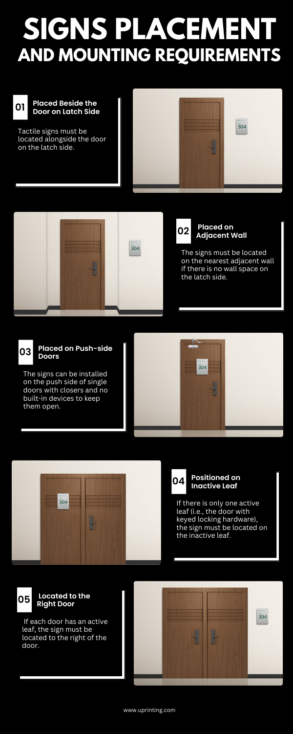
Placement and Mounting Requirements
The ADA requires signs to be mounted at a “visible” height for standing and seated users.
Raised characters and braille texts must be 48 inches to 60 inches above the finish floor or ground surface (when measured from the baseline of the highest tactile character). This placement is conducive to tactile reading.
Additionally, there should be at least 18 inches of clearance around the tactile characters, and they must be located beyond the arc of a door when opened at a 45-degree angle. This placement aims to provide unobstructed standing space to allow people to read the signs by touch.
Benefits of ADA-Compliant Signage Beyond Legal Requirements
Complying with the ADA signage requirements is not just about avoiding hefty fines, lawsuits, and other legal implications. You can reap a long list of benefits when you use signs that adhere to the standards.
1. Enhanced Customer Experience
With ADA-compliant signage, people can navigate the premises conveniently and safely. Remember, improving customer experience is the key to repeat business, customer loyalty, and your company’s long-term success.
In addition, effective wayfinding signs reduce frustration and delays for everyone, not just individuals with disabilities. Families with strollers, first-time customers or visitors, and older people can also benefit from ADA-compliant signages.

Source: mydoorsign.com
2. Improved Brand Image and Reputation
Source: identitygroup.com
Businesses that demonstrate social responsibility and inclusivity are often seen as progressive, trustworthy, and compassionate. This positive public perception can help them stand out from the competition and enjoy customer loyalty.
3. Enhanced Employee Productivity and Morale
Using ADA-compliant signs creates a more inclusive and accessible workplace, which benefits everyone, including employees with disabilities who can work efficiently and safely.
Companies that demonstrate their commitment to accessibility and inclusivity also enjoy better recruitment opportunities and increased employee satisfaction.
4. Government Grants and Funding Opportunities
Having ADA-compliant signs could help you qualify for certain government grants and funding, especially for improving accessibility and inclusivity.
Many government-funded programs for community services and infrastructure prioritize projects that can help improve the lives of people with disabilities.
5. Long-term Cost Savings
Maintaining and auditing ADA-compliant signs periodically demonstrates your commitment to improving your facility’s accessibility. Moreover, it can help you prevent expensive retrofitting and compliance issues in the future.
Most Common ADA Signage Mistakes You Should Avoid
Here are the most common mistakes when designing and installing signs. These oversights not only violate the ADA standards but also make the signs ineffective and misleading.
1. Incorrect Placement
Signs mounted too high or too low may not be easily seen by the public. According to the ADA guidelines, they should be mounted at a height where both standing and seated individuals (such as wheelchair users) can read them easily.
Installing signs in poorly lit areas and close to obstructions like shrubs and trash bins can also make them ineffective.
2. Lack of Tactile Text and Braille
The ADA requires specific types of signs to meet the tactile requirements. These signs are typically used to help people navigate buildings easily (e.g., floor-level signs) and lead them to safety during emergencies (e.g., exit stairway signs). Failure to include tactile characters may lead to accidents and lawsuits.
3. Poor Contrast
An example of poor color contrast would be a combination of white and light yellow, which is difficult to read due to the lack of light and dark color separation between them.
Also, green-red and yellow-blue color combinations present challenges to many people with color blindness, while white text on a black background may create a visual fuzzing effect for people with corrective lenses.
4. Hard-to-Read Fonts
Fonts with irregular and elaborate shapes can make signs difficult to read. The same is true for tightly packed fonts in which the letters overlap and look squashed, creating difficulty for certain readers.
Even if elaborate fonts are used sparingly as headings, they are still challenging to read because of their irregular letter shapes, forcing individuals to pause or move closer to the sign to examine the characters.
5. Non-standard Symbols
The ADA uses icons from the International Symbol of Accessibility (ISA). These are also adopted by the International Organization for Standardization, a group of over 160 national standard-setting entities.
The ISA must be used even if a state or local code specifies a different symbol unless the alternative offers “substantially equivalent or greater accessibility and usability.”
6. Lack of Information
Lack of information (e.g., room number) and key features (e.g., raised and braille characters) can pose difficulties to people with visual impairments.
Permanent room number and informational content (e.g., Accounting) should meet the ADA requirements, while the occupant’s name and title are exempt.
7. Poorly Maintained Signs
Signs that are dusty, faded, and obstructed by overgrown plants may cause confusion, delays, and even accidents. Poorly maintained signage can also lead to negative perceptions of a business.
Signs used in commercial and public spaces should undergo regular inspection, cleaning, and maintenance to help people navigate buildings conveniently and safely.
5 Ways to Ensure Your Signs are ADA-Compliant
Follow these tips to ensure that your signs adhere to the ADA
standards.
Legal Implications of Non-Compliance
Non-compliance with ADA signage standards can lead to costly legal repercussions.
1. Lawsuits
Failure to meet the ADA requirements can expose your business to lawsuits from individuals and advocacy groups representing people with disabilities. If non-compliance affects a large number of people, you may also face a costly class action lawsuit.
2. Compliance Orders
Courts and government agencies can order a business or facility to adhere to the ADA signage requirements. Failure to make the necessary changes and improvements could result in fines or legal action.
3. Loss of Government Contracts and Funding
Businesses and organizations that receive federal funding may lose contracts and funding if they fail to comply with the ADA standards.
ADA-compliant signs have specific design features and placement to accommodate people with disabilities, such as wheelchair users and individuals with low vision and other types of visual impairment.
It’s critical to adhere to the ADA standards to enhance customer safety, promote a positive brand reputation and image, avoid hefty fines and lawsuits, and enjoy long-term cost savings.